-
I want to thank all the members that have upgraded your accounts. I truly appreciate your support of the site monetarily. Supporting the site keeps this site up and running as a lot of work daily goes on behind the scenes. Click to Support Signs101 ...
You are using an out of date browser. It may not display this or other websites correctly.
You should upgrade or use an alternative browser.
You should upgrade or use an alternative browser.
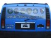
Hummer Wrap
- Thread starter phatgrafix
- Start date

DRPSignsNGrafix
New Member
looks nice
Lunatic Taskbar
New Member
I really like it, I especially like the hat and eyes that look like a car, very nice.
2972renfro
New Member
I tend to look at details. The first thing I noticed was the lettering that was cut off by features on the Hummer. The gas cap for instance knocks out the word CAR. This should not have been allowed to occur. Bottom tagline does the same thing. There was room to avoid having it cut off
Also text on back window and hood is off center, by alot
If it was my car, that would be my beef.
Also text on back window and hood is off center, by alot
If it was my car, that would be my beef.
k6media
New Member
Hmm.. honestly, it looks as though the graphics weren't designed for the hummer but merely printed and installed wherever would fit with the least amount of issues. It's actually a little confusing to be quite honest... also the rear window isn horizontally not centered.. the hood is also not centered.
I very seldom give poor feedback.. but I am not a fan of this wrap..
I very seldom give poor feedback.. but I am not a fan of this wrap..
WellbornSignCo.
New Member
The hood graphic & back window graphic are off center.
KR3signguy
New Member
Cute logo.
Horrible letter positioning on the sides.
I can't understand why anyone would waste
hundreds of dollars a month on gas.
Horrible letter positioning on the sides.
I can't understand why anyone would waste
hundreds of dollars a month on gas.
GK
New Member
Ya know, I really love the simplicity of this wrap, the logo is awesome -- but poor font choices and terrible placement kill the overall look and feel. Text getting cut off is always a bad thing. If the general logo itself needs to run through a handle or other feature of the car; so be it, but text should always be legible and away from things that will chop it up.
Samm
New Member
Ya know, I really love the simplicity of this wrap, the logo is awesome -- but poor font choices and terrible placement kill the overall look and feel. Text getting cut off is always a bad thing. If the general logo itself needs to run through a handle or other feature of the car; so be it, but text should always be legible and away from things that will chop it up.
Ditto. Looks to be a nice clean wrap though, well done
")
Sam
Craig Sjoquist
New Member
I do hope you take this all the good advise as a good leason and come back with a outstanding next wrap
because did do a few things real well so ...
font crazy
because did do a few things real well so ...
font crazy