-
I want to thank all the members that have upgraded your accounts. I truly appreciate your support of the site monetarily. Supporting the site keeps this site up and running as a lot of work daily goes on behind the scenes. Click to Support Signs101 ...
You are using an out of date browser. It may not display this or other websites correctly.
You should upgrade or use an alternative browser.
You should upgrade or use an alternative browser.
Review Logo for Hurrah Players
- Thread starter Capt Rocco
- Start date
JBurton
Signtologist
Wait, kermit?My family name is from the famous green muppet that lives in the garbage can.

Capt Rocco
New Member
Okay, things I designed in 2021 for Christmas. It is "Bethlehem Inn" Interactive Dinner Theatre for Theatrix Productions.
This is a poster...
 Poster (Website).jpg")
...this is the bottle label for dipping oil...
.jpg")
...this is a basic logo...
 Small.jpg")
...so, tell me what you think?
This is a poster...
...this is the bottle label for dipping oil...
...this is a basic logo...
...so, tell me what you think?
Stacey K
I like making signs
I think the poster looks great. I like the colors, the photo placement is nice also. I normally wouldn't use all caps but there aren't that many words so it's OK IMO.
The label is good, but you didn't kern the h and s in Leahs'.
For the general logo, I'm not sold on the star above the "I". I get that it dots the "I" but for some reason my eye looks at the line on the bottom of the star and the top of I. However, I know sometimes customers have these ideas so you have to work with them. It seems like the kerning is off in An Interactive Dinner Theatre.
Overall I like it all!
Boudica
I'm here for Educational Purposes
Most of it looks pretty nice. Not bad for a movie poster. Or theatre in this case.
I don't like the food part. It's too busy and dark. The image collage is too choppy, make it blend better. No black stroke on the food item names, add a thinner white stroke to make it bolder, and space the kerning a bit more.
I don't like the food part. It's too busy and dark. The image collage is too choppy, make it blend better. No black stroke on the food item names, add a thinner white stroke to make it bolder, and space the kerning a bit more.
Texas_Signmaker
Very Active Signmaker
A 5 course meal? No wonder this country is so fat..
Johnny Best
Active Member
I like the Bethlehem Inn wit drawing of city but everything else, no likes.
Did Joseph get DoorDash for himself and Mary, the Shepherds paid for it.
Did Joseph get DoorDash for himself and Mary, the Shepherds paid for it.
Boudica
I'm here for Educational Purposes
better than purple potato tacos with mustard and mushy green stuff.A 5 course meal? No wonder this country is so fat..
White Haus
Not a Newbie
Love the "Here is the food that weserve to you" part. Not sure if it's supposed to be funny, but it made me chuckle.
Also, took me a minute to get the 1-star bit.
Also, took me a minute to get the 1-star bit.
Boudica
I'm here for Educational Purposes
I don't like the placement of the star either. It's a capitol "I" - it doesn't get a dot. It shouldn't be running into the lettering, needs some spacing around it.For the general logo, I'm not sold on the star above the "I". I get that it dots the "I" but for some reason my eye looks at the line on the bottom of the star and the top of I.
Notarealsignguy
Arial - it's almost helvetica
I'm stuck on "mid eastern" shouldn't it be middle eastern or mid east?
Boudica
I'm here for Educational Purposes
Geeze you're picky.I'm stuck on "mid eastern" shouldn't it be middle eastern or mid east?
Boudica
I'm here for Educational Purposes
He's talking about a Sesame St Muppet. Not the Muppet Show Muppets.Wait, kermit?
Gino
Premium Subscriber
Middle-Eastern. Mid Eastern is about where I live here in PA. However, there is a town just to the north of us about 40 miles called Bethlehem.

 bethlehempa.org
City of Bethlehem, PA | History Lives Here
Welcome to Bethlehem, Pa, where the historic and new collide. Learn about local festivals, dining, shopping, and all the things to do.
bethlehempa.org
JBurton
Signtologist
I am not a fan of this much... I guess gaudiness crammed into one line of text. It's embossed, outlined, drop shadowed, cropped drop shadow, highlighted, and distressed. Gives migraine vibes. Though the one without highlight or embossment looks pretty good.Also, what would you do, if you didn't have photoshop for ALL those effects ??
Oh, I seeHe's talking about a Sesame St Muppet. Not the Muppet Show Muppets.

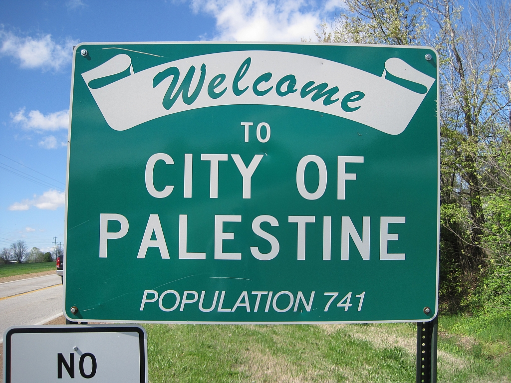
I'll see your Bethlehem, PA, and raise you one Palestine, AR.north of us about 40 miles called Bethlehem.
Palestine, Arkansas - Wikipedia
Boudica
I'm here for Educational Purposes
I used to work in the shipping dept in another life, we got a kick out of some of the city names we were shipping to in PA. So much that we got a map of PA just to see how many other wacky names there were. Its hilarious.Not to ruin this guy's thread, but if you wanna start another thread, I know PA will beat out your state....... hands down for weird/funny names.