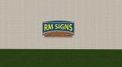
Logo for me. B&W on the top obviously. Bottom two are two different color combinations. Colors still need tweaking. I'm going to try to work up another version over the weekend.
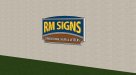
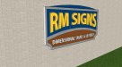
My #1 priority was making a logo that would look good when made into a dimensional sign, could be used in print, web, and promo type items. When making it a sign, I wanted it to be very strong but also didn't require a ton of time/technique to produce. There are a lot of really talented people out there doing really awesome truly 3d stuff. That's not for me. I like either the "New England" style v-carve or essentially stacking material at different thicknesses to create dimension.
My #1 priority was making a logo that would look good when made into a dimensional sign, could be used in print, web, and promo type items. When making it a sign, I wanted it to be very strong but also didn't require a ton of time/technique to produce. There are a lot of really talented people out there doing really awesome truly 3d stuff. That's not for me. I like either the "New England" style v-carve or essentially stacking material at different thicknesses to create dimension.