-
I want to thank all the members that have upgraded your accounts. I truly appreciate your support of the site monetarily. Supporting the site keeps this site up and running as a lot of work daily goes on behind the scenes. Click to Support Signs101 ...
You are using an out of date browser. It may not display this or other websites correctly.
You should upgrade or use an alternative browser.
You should upgrade or use an alternative browser.
Looking for a font that looks like an egyptian font any hand letterer would use.
- Thread starter RiXaX
- Start date
White Haus
Not a Newbie
Does this help?
James Burke
Being a grandpa is more fun than working
Dang it! I was going to post that! Probably the best 3:22 of my day.Does this help?
Ayyyyyyyy-ohhhhhh-wayyyyyy-ohhhhh. Ayyyyyyyy-ohhhhhh-wayyyyyy-ohhhhh.
I do think, however, that Susanna Hoffs and the rest of her gals will only distract the OP from finding a suitable solution.
But seriously, I googled the phrase "Pharoah font" and found a boat-load of stuff.
JB
Last edited:
I expect anyone that learned how to pick up a brush and letter without a pattern and worked in a commercial sign shop would know what an egyptian letter is. It has no serifs or thick and thin stroke values like a roman letter. Traditionally, it's pulled with one stroke and the terminals are cleaned up. It lacks the stiffness and sterility of helvetica. It reveals some of the personality of the person with the brush. Where I apprenticed, one person could set down the brush in the middel of a line of text and anyone else could pick up a brush and continue the line without anyone being able to tell that there was a switch.
astro8
New Member
Edited..
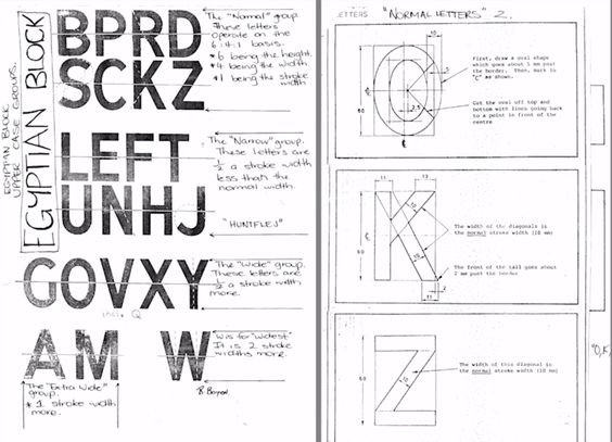
Identical to what I was taught as an apprentice.....

A few differences here and there and the strokes are a touch thicker on this version, but at least you can buy it....


Identical to what I was taught as an apprentice.....
A few differences here and there and the strokes are a touch thicker on this version, but at least you can buy it....

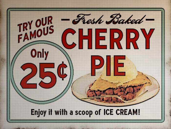
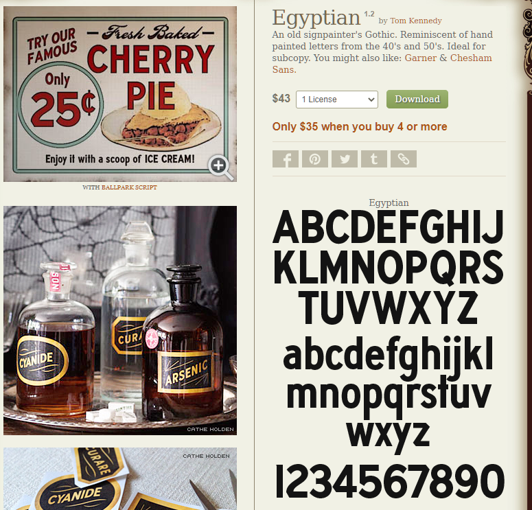
LHF Egyptian font
An old signpainter's Gothic. Reminiscent of hand painted letters from the 40's and 50's. Ideal for subcopy.
www.letterheadfonts.com
Attachments
Last edited:
signbrad
New Member
Sign painters traditionally had their own names for the letter styles they used. Egyptian, as I recall, was a catch-all term and had nothing to do with Egypt or the middle east. Gothic too, was simply a generic reference to a straight, nonserifed letter. Every sign painter learned a "plain gothic," with slight variations. It was a workhorse, used all the time. It was not based on a typestyle, and it certainly wasn't created from a "font" which was the name for a collection of type. Fonts were made of metal and found only in printeries. The word font was never used as a synonym for letter style, or typestyle.* Sign painters called their letter styles alphabets. The word font was never heard in a sign shop, as is evidenced by the sign industry literature of pre-computer years. Even in print shops, the word always referenced metal type collections purchased from font foundries. Font never referred to the style of a letter. A font was what a printer used to print typestyles on paper. As author and typographer Carolina DeBartolo said on Quora a few years ago, "A font is what you use, a typestyle is what you see."
https://carodebartolo.com/bio
Another point: a sign painter's alphabets were generally not slavish imitations of printer's typestyles, but were developed on their own, though occasionally an architect would specify a typestyle, requiring a sign painter to use it. Obviously, many of the sign alphabets were inspired by typestyles. But most sign makers knew that many typestyles do not function well at large sizes. So, they didn't copy them, or modified them if they did. The sign painter's world and the printer's world did not overlap much. But today, a sign often looks like "print." A sign covered in Times Roman, for example, looks weak, anemic, with way too much whiteness. It looks more like a page than a sign. Times Roman was designed for newspaper-size print, not for signs. Its lightness actually benefitted from cheap newsprint (because of dot gain). But on signs, as viewing distance increases, the thin strokes of this typestyle tend to disappear, leaving visible only a bunch of meaningless vertical strokes. Even the bold versions have this problem. Try overlaying Times Bold over other versions of Times. You'll find the thin strokes don't change much, if at all. So, using the bold version does not solve the problem of the skinny strokes. You can solve the problem by thickening the thin strokes, which was easily done when brush lettering. But not so easy to do from a keyboard. The real solution is to not use Times Roman on sign work, or to use it only rarely.
As I was coming up in the trade in the 70s, sign painter's gothic, or egyptian, if you will, was used far more than any other alphabet. It was used everywhere and on everything. A good journeyman could chew through large quantities of single-stroke gothic with consistency and speed. You could often identify a sign painter by looking at his gothic, though a sign painter's casual styles were even more identifying. And in spite of the fact that plain gothic was used far more than any other letter style, I don't remember anyone in the trade ever complaining about it. So it is ironic, baffling even, for me to hear someone advise not using a letter style today because it's "overused." It seems as silly as saying, "Don't use red." Because isn't red overused? Almost every customer requests red because it "stands out." So, how is their red lettering going to stand out from all the other red lettering?
I remember an old sign painter once telling me he used basically six letter styles for everything. Obviously, the six letter styles were "overused." I'll bet he used the same coffee cup every morning, too. He probably overused everything.
.....................
*I realize that language is like a living, breathing animal. Words evolve and change in meaning and usage. But it helps to at least know how words were used originally in our industry, as well as in the print industry. Especially so as the lines between the two continue to blur. It helps clear up things that are otherwise confusing. For example, in the US, a font is protected by copyright while a typestyle is not. How could this be if they are the same, or if one is just a subdivision of the other? A font is no longer made of metal, of course, but composed of digital code. The US Copyright Office protects a font as a computer program (as long as it is human-written digital code), a "work of authorship." But the design of the letter forms, the typestyle, has never been protected in the US.
Last edited:
I apprenticed to a man from Kansas City. He left there in 1952 and moved to LA. He was a native American raised on a reservation. Seems like they called letters Egyptions or Romans or casuals or scripts. They were formal or bold. I never heard the word font in a sign shop until the computers came into the game in the early eighties.Unclebun, we never called it Egyptian, either. We just called it gothic or straight gothic. Though I have been in Kansas City for a while, I came up in the trade in Illinois in the Peoria area.
Sent from my iPhone using Tapatalk
kcollinsdesign
Old member
Egyptian is a carry-over from the "Egyptomania" that swept Europe (and the Americas to some extent) as a result of Napoleon's Egypt campaign. Sans serif alphabets were at the time exotic, and became part of the exotic oriental "Egyptian Style" that was popular at the time. Likely that the "blocky" nature of Egyptian architecture informed the use of "blocky" sans serif letters. Foundry's called their sans serif alternates "Egyptians", and the term stuck with architect and sign painters.
The specimen example is from around 1816, the monumnet was created in 1832.
The specimen example is from around 1816, the monumnet was created in 1832.
Attachments
Ian Stewart-Koster
Older Greyer Brushie
'Egyptian', I used to find mentioned most in older sign painting books... We just called them block letters, or plain block letters, as opposed to a thick-and-thin block letters.
The nicest most practical computer font these days of that style that I like is Work Horse, from LHF, developed by Greg Reid and Charles Borges de Olivero. It's bold, clear, and has a little style or flair, and closely matches the old honour board gilded letters I often paint. Warning the computer font it does not take outlines well, there are a coupe of nodes that send outlines or contours off course - but that's node-editable easily enough.
The nicest most practical computer font these days of that style that I like is Work Horse, from LHF, developed by Greg Reid and Charles Borges de Olivero. It's bold, clear, and has a little style or flair, and closely matches the old honour board gilded letters I often paint. Warning the computer font it does not take outlines well, there are a coupe of nodes that send outlines or contours off course - but that's node-editable easily enough.
kcollinsdesign
Old member
I talked up Workhorse in another thread. I lean on it pretty hard, but most people can't guess what it is (nor are they inclined to). Just a great font that hearkens back to the days of utilitarian hand sign writing.'Egyptian', I used to find mentioned most in older sign painting books... We just called them block letters, or plain block letters, as opposed to a thick-and-thin block letters.
The nicest most practical computer font these days of that style that I like is Work Horse, from LHF, developed by Greg Reid and Charles Borges de Olivero. It's bold, clear, and has a little style or flair, and closely matches the old honour board gilded letters I often paint. Warning the computer font it does not take outlines well, there are a coupe of nodes that send outlines or contours off course - but that's node-editable easily enough.
Funny thing, LHF has some outstanding offerings. I have quite a collection. But Workhorse, as simple as it seems, is by far and away my favorite!
Ian Stewart-Koster
Older Greyer Brushie
We'll just have to keep it our little secret then - 'utilitarian' is an understatement for Workhorse!I talked up Workhorse in another thread. I lean on it pretty hard,
kcollinsdesign
Old member
Funny! I actually hesitated before I mentioned this font. I don't give up my morel patch or my favorite sweet corn stand either!We'll just have to keep it our little secret then - 'utilitarian' is an understatement for Workhorse!


