-
I want to thank all the members that have upgraded your accounts. I truly appreciate your support of the site monetarily. Supporting the site keeps this site up and running as a lot of work daily goes on behind the scenes. Click to Support Signs101 ...
You are using an out of date browser. It may not display this or other websites correctly.
You should upgrade or use an alternative browser.
You should upgrade or use an alternative browser.
Looking for advice on project
- Thread starter Redtech96
- Start date
Graphic Destruction
New Member
Marlene
New Member
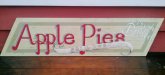
I like the idea of this design and the colors. the main lettering could have been pushed up more towards the top so the banner swooped under the lettering and not over it or just barely over it. I like the feel of it as I would buy a pie here as it looks like it might be baked by someone's grandma. the shadow feels off to me as it looks to be more to the left and up so if makes the main copy feel like it is dropping down rather than rising up.
John Butto
New Member
like Billct2 says
Needs more contrast as you can see.
If you're going for a vintage homemade sign it works. The banner & Sold Here ned more contrast
Needs more contrast as you can see.
Attachments

Marlene
New Member
it depends where you are using this sign. as an interior sign or one just outside the door with other signs to ID the business, no need for in your face contrast. if it is all they have and will be used something like what John showed, then it needs contrast to be seen. where and how a sign is used makes a difference.
Thank you
Thank you everyone. This is really helpful! I will keep all this in mind on the next project. The shadowing looked a bit strange to me too, but couldn't put my finger on it. The example that John showed really helped. I will work on my layouts and visual concepts a little more.
Thank you everyone. This is really helpful! I will keep all this in mind on the next project. The shadowing looked a bit strange to me too, but couldn't put my finger on it. The example that John showed really helped. I will work on my layouts and visual concepts a little more.
2B
Active Member
the main lettering could have been pushed up more towards the top so the banner swooped under the lettering and not over it or just barely over it.
since you are going for the "apple" feel, use the color of an apple's inside as the "sold hear" color. Since you are using the skin color for the main copy.
This will keep the subtle color but add just enough coloring for the people who as looking to find it easier.