Z SIGNS
New Member
Got a job designed by an architect.
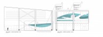
The specs are halo lit channel letters.Black face and returns installed to a white eifs background.
My concern is that it will be hard to read,black letters that make a black shadow, especially at a slight angle.
Also concerned that the eifs will absorb the light and not make decent halo.
I'm thinking of proposing white or brushed letters mounted to a dark colored panel.
What do you think?