-
I want to thank all the members that have upgraded your accounts. I truly appreciate your support of the site monetarily. Supporting the site keeps this site up and running as a lot of work daily goes on behind the scenes. Click to Support Signs101 ...
You are using an out of date browser. It may not display this or other websites correctly.
You should upgrade or use an alternative browser.
You should upgrade or use an alternative browser.
More of Phillip's handywork...
- Thread starter Moze
- Start date


signmastercape
New Member
Looks good!
Craig Sjoquist
New Member
Likes your card very nice, great readable logo & identifiable
GAC05
Quit buggin' me
Thanks guys - I think he did a great job.
110 views and 2 comments. Everyone else must be speechless with approval.
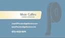
Just by looking without background info, the use of soft pastel blues and what appears to be a tailor's cloth measuring tape does not scream "Precision Sign Services" to me.
Bolder colors and a more striking icon/logo would be my direction.
You like it and know your market better than anyone here so it could be the wining ticket you had in mind when making the changes.
wayne k
guam usa
SignStudent
New Member
Looks good but did anyone else notice it looks kinda phallic?
Pat Whatley
New Member
That's what I was thinking. Love the style, love the flow, just doesn't seem to fit the subject.Jthe use of soft pastel blues and what appears to be a tailor's cloth measuring tape does not scream "Precision Sign Services" to me.
Moze
Active Member
Just by looking without background info, the use of soft pastel blues and what appears to be a tailor's cloth measuring tape does not scream "Precision Sign Services" to me.
Bolder colors and a more striking icon/logo would be my direction.
You like it and know your market better than anyone here so it could be the wining ticket you had in mind when making the changes.
wayne k
guam usa
The colors are something I struggled with throughout the process - Phillip presented quite a few and I steered him down this road. Maybe I should have chosen one of the other options, but I actually kind of like the muted colors. The blue was chosen from a Pantone chart and is more of a gray-blue than a pastel blue. Color settings on computers vary so much, it may appear differently to you than it actually is. Heck, on my iPad/iPhone they look green.
I do use a standard retractable tape measure for my work, but ironically I do use a sewing (tailors) tape measure to obtain the circumference of sign poles. While it isn't 100% literal, I think it conveys at a glance that measurements are a key component of what I do.
Looks good but did anyone else notice it looks kinda phallic?
It's in the shape of the letter 'P'. I think the issue would be more with your thought process than the shape of the icon.
That's what I was thinking. Love the style, love the flow, just doesn't seem to fit the subject.
How so?
Like the logo, looks like the card was rushed.
The card was pretty much his first draft and I liked it right away. Made a few changes, but it was clean and simple which is what we were going for. What in particular do you not like about it?
Thanks for the input, everyone.

Pat Whatley
New Member
How so?
I just don't equate the cloth tape measure with "Precision". It says "TAILOR" or "ALTERATIONS" to me. But that's just me....you know more about the image that will work for your company than I do. Again, the work is Phillip's usual, wonderful style.
Moze
Active Member
Gotchya...
Yeah, and in all fairness, he did present options with a standard tape measure, but this design was the one I kept going back to. It just looks very recognizable to me. Not that I'm a large sign company by any means, but I can see the design on the door of a sign truck and just the overall shape and structure would be pretty memorable.
Some of his other designs definitely had more 'zing' but I just really liked this one.
I guess it's like that "Cooking" logo that was posted in another thread that used the electric burner as it's icon. Yes, most chefs use gas, but the electric burner is immediately associated with cooking.
Anyway, I do appreciate everyone's opinions.
DizzyMarkus
New Member
It's tough to come up with something uncommon for Precision other than the traditional calipers, tape measure, bulls eye, or laser icon.
If your happy good choice ;0)
Markus
If your happy good choice ;0)
Markus
WildWestDesigns
Active Member
I just don't equate the cloth tape measure with "Precision". It says "TAILOR" or "ALTERATIONS" to me. But that's just me....you know more about the image that will work for your company than I do. Again, the work is Phillip's usual, wonderful style.
I can see that. Especially since it does look like the plastic tape measure that is commonly used with textile work. I know I use them all the time.
Wonderful work though. I think it works well myself.
Gino
Premium Subscriber
I like everything about it. I’ve been a huge fan of Phillip’s work for a long time. I believe he’s an underrated talent, just waiting to break into the big-time. The whole logo here has great colors, a kinda retro feel and gets the point across, but like Pat said…. not for your business, Moze.
In your line of business, to get the feel of precision and top notch quality, this looks too loose, bouncy and unreliable. Even a metal ruler, with some cogs or inter-fitting geometric shapes would get the idea across better. This definitely oozes tailor or seamstress. If it works and you like it, then it doesn’t matter what anyone else thinks. You’re paying the tab and it’s your final decision. Just that you asked and we gave…………..
In your line of business, to get the feel of precision and top notch quality, this looks too loose, bouncy and unreliable. Even a metal ruler, with some cogs or inter-fitting geometric shapes would get the idea across better. This definitely oozes tailor or seamstress. If it works and you like it, then it doesn’t matter what anyone else thinks. You’re paying the tab and it’s your final decision. Just that you asked and we gave…………..
bob
It's better to have two hands than one glove.
Sorry, this says 'signs' like peanut butter says tire repair. I don't understand the stream of gratuitous complements and cautiously mild criticism unless these people either owe you money or their guide dogs were off chasing balls.
Why do I feel like the one pointing out the emperor's lack of clothes here?
Not only does in not convey its primary message, the typography is dubious, the colors are bilious, and the layout is strictly bush league. I have no idea just who this Phillip might be but if this is a sample of its work it shouldn't quit its day job just yet.
longlivemedia
New Member
These are really nice cards. Everything looks perfect from concept to colors.
HulkSmash
New Member
Sorry, this says 'signs' like peanut butter says tire repair. I don't understand the stream of gratuitous complements and cautiously mild criticism unless these people either owe you money or their guide dogs were off chasing balls.
Why do I feel like the one pointing out the emperor's lack of clothes here?
Not only does in not convey its primary message, the typography is dubious, the colors are bilious, and the layout is strictly bush league. I have no idea just who this Phillip might be but if this is a sample of its work it shouldn't quit its day job just yet.
It's possible that we like it Bob...that's why there's complements.
I would love to see one of your pro designs one day.
SignProPlus-Chip
New Member
It looks complete and finished, but I have to agree with others here.
I don't see "sign company" or "precision" in this logo design.
Something about the kerning on the type is bugging me. The text, "sign services"... I would have opted for a different font for that part altogether.
They can't all be winners, or appeal to everyone though. But food for thought, it should appeal more to your potential client base than your own sense of aesthetics.
Out of curiosity, and not really related to the critiques here...What kind of signage does Precision Sign Services specialize in? Where does the "precision" come into play?
Craig Sjoquist
New Member
Well my 1st statement was a....great readable logo & identifiable.
When you drive & coming up to a intersection ( you can see the red light or stop sign )
A truck or van rolls by in front of you eyes... you would be able to read this & identify before it crosses the road your traveling.
That is the whole point. you must identify & read, the FABRIC tape measure makes a .... P... BONUS ya can not do that with any other single measuring device & BE recognizable.
Plus putting tape in a shape of a P into a odd shape that fits the flow.
The image...retro, hands on family service, non hard sell. that is the colors & style of logo is what i see... & that IS POSITIVE.
Excellent logo, outstanding.