-
I want to thank all the members that have upgraded your accounts. I truly appreciate your support of the site monetarily. Supporting the site keeps this site up and running as a lot of work daily goes on behind the scenes. Click to Support Signs101 ...
You are using an out of date browser. It may not display this or other websites correctly.
You should upgrade or use an alternative browser.
You should upgrade or use an alternative browser.
"My brother-in-law is a graphic designer in New York City" oh yay...
- Thread starter jtiii
- Start date
Notarealsignguy
Arial - it's almost helvetica
XXX Plowing and hot crack fillsNotarealsign guy will see "hot crack fill" and call that phone number so fast
Sign got my attention!
Really though, both the designs suck but I'd choose the one that someone else made for free.
Carol Sundberg
New Member
Ray Miller's design is the best of the 3.
JBurton
Signtologist
I thought for sure this would throw some red flags, but here yar:Got that Burtie? Time for the ai bing version.... Stacked V shape, hot crack fill and a Weiner.
Instruct the creative robot that the double v should be stabbing the Weiner.
Also, here's one dropping the weiner, makes the whole process seem rather epic.
The whole situation is a lose lose. If you make these at 18x24, he'll get 0 traction in his advertising and his relatives will disown him, if you change it, his relatives will disown him. Tell him you really love his new business card layout, but you thought he wanted some signs...
mfatty500
New Member
All of a sudden my ass is getting warm, but not lumpy.You had me at "hot crack fill".
VizualVoice
I just learned how to change my title status
why would you be AT ALL surprised by that here?Seems to me, many of you are going off-track and thinking too much about the hershey highway, instead of a layout discussion.

Gino
Premium Subscriber
why would you be AT ALL surprised by that here?
Where did I say "surprised" ?? Just people are getting a little too descriptive.
VizualVoice
I just learned how to change my title status
I think you're getting stuck in the "mud"Where did I say "surprised" ?? Just people are getting a little too descriptive.

rvolkers
New Member
rvolkers
New Member
we have a winner!I took a stab at this. I like both, but the OP's much more.
Texas_Signmaker
Very Active Signmaker
SignDesignLady
Always Learning
jtiii
I paid good money for you to read this!
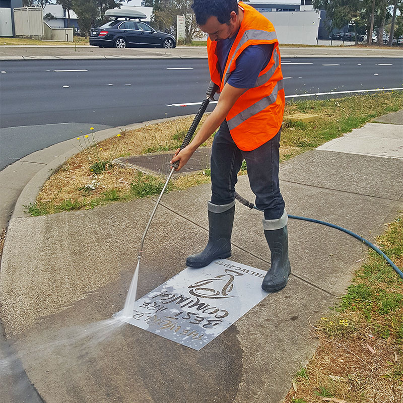
What is this voodoo of which you speak? Where do you get or how do you make the stencil? I haven't had good luck.a stencil to powerwash/chalkspray onto sidewalks
MikePro
Active Member
cnc routed aluminum or dibond panel, with bridges to connect centers of letters.What is this voodoo of which you speak? Where do you get or how do you make the stencil? I haven't had good luck.
Notarealsignguy
Arial - it's almost helvetica
I thought for sure this would throw some red flags, but here yar:


Also, here's one dropping the weiner, makes the whole process seem rather epic.

The whole situation is a lose lose. If you make these at 18x24, he'll get 0 traction in his advertising and his relatives will disown him, if you change it, his relatives will disown him. Tell him you really love his new business card layout, but you thought he wanted some signs...
Chat gpt, show me a mansion in Arkansas

GAC05
Quit buggin' me
It's missing the truck up on cinder blocks.Chat gpt, show me a mansion in Arkansas
View attachment 171071