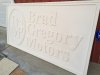
Sometimes with dimensional
signs, they will look flat from a distance. If you ever look at how dimensional
signs are photographed, they are almost always taken with very little background and close to the
sign. Why? Because stand 50 feet back and you might not see all the detail and in fact it might not look that dimensional.
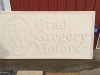
I did a project last summer for a customer and they decided we had to mount it 15 feet further back than I recommended (they wanted on a fence. I wanted it on a couple of posts). End result was the
sign looked good still BUT it lost the dimensional look because of distance. So when you stood 50'+ back, it didn't look that dimensional. I learned from that
sign to try to push the limit of creating depth as much as possible because otherwise the desired effect can be lost.
I think with this
sign, with a few tweaks, you could have achieved a much more dimensional look for the same cost or potentially less. I can guarantee it would have been faster to make.
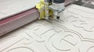
In my head, I would have had 1/8" white ACM (DiBond/MaxMetal) as my background. I would have cut the boarder out of strips of 1" PVC. Painted them black. Then glued/screwed them to the ACM. For the actual logos, I would have taken the same 1" PVC and done applied letters. That way instead of only getting about .25" of dimension, you're getting closer to 1". Way more contrast of depth.


 The business next door has a plywood