-
I want to thank all the members that have upgraded your accounts. I truly appreciate your support of the site monetarily. Supporting the site keeps this site up and running as a lot of work daily goes on behind the scenes. Click to Support Signs101 ...
You are using an out of date browser. It may not display this or other websites correctly.
You should upgrade or use an alternative browser.
You should upgrade or use an alternative browser.
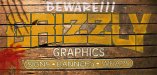
My logo... thoughts?
- Thread starter LEGEND
- Start date

LEGEND
New Member
I don't like your newest "graphics" with your "Grizzly" font, it's too busy & and as others have said
it's repetitive and not needed. I would simplify it up like this, but center everything up better:
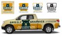
I think Jill meant it was repetitive because i had graphics on there twice... and being that the name is actually Grizzly Graphics, i think i'd rather just leave it on there. but thanks for everyone's suggestions! i think it's almost there!

I think Jill meant it was repetitive because i had graphics on there twice... and being that the name is actually Grizzly Graphics, i think i'd rather just leave it on there. but thanks for everyone's suggestions! i think it's almost there!
Okay, I see that now.
I hope you don't mind, I was bored so I made your logo into a Halloween Image.
Attachments
SignStudent
New Member
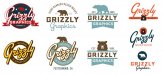
My vote goes to post #19 for sure.
LEGEND
New Member
Okay, I see that now.
I hope you don't mind, I was bored so I made your logo into a Halloween Image.

hahaha i dig it... :ROFLMAO:
LEGEND
New Member
My vote goes to post #19 for sure.
Sweet, thanks. I think that one might be the one... might play with the claw scratch a bit and see.
Rick
Certified Enneadecagon Designer
I think #19 is looking pretty good, I would make the area for "signs, banners and wraps" completely round...
these are leftover ideas from the last bear themed thread and added your name for poops and giggles...
being in California, the bear is an iconic symbol and sticks in your head...
these are leftover ideas from the last bear themed thread and added your name for poops and giggles...
being in California, the bear is an iconic symbol and sticks in your head...
Attachments
Dig it, I implemented some of your advice into this one...

For me, in my opinion, there is something not flowing with the arc on the bottom of Grizzly. It seems out of place with the rest of it. I would try it without the arc. Perhaps a larger G and Y...?
I would also open up a small amount of space between some of the letters because the negative or open space between the L and Y and to a lesser extent the ZZ's make the GRI too tight visually.
Stormyj
Just another guy
After looking at your starting a business thread... I was bored (and inspired) and thought I would play with it a little more...
I know you were just playing, but now all I can think of is that "Only I can prevent forest fires".

Rick
Certified Enneadecagon Designer
I know you were just playing, but now all I can think of is that "Only I can prevent forest fires".
View attachment 109647
Muggle!
Attachments
LEGEND
New Member
I think #19 is looking pretty good, I would make the area for "signs, banners and wraps" completely round...
these are leftover ideas from the last bear themed thread and added your name for poops and giggles...
being in California, the bear is an iconic symbol and sticks in your head...
Sweet, thanks for all the suggestions. Do you have stock graphics on hand for those bears and shapes? jw since you did a few variations of it.... very cool either way.
Rick
Certified Enneadecagon Designer
Sweet, thanks for all the suggestions. Do you have stock graphics on hand for those bears and shapes? jw since you did a few variations of it.... very cool either way.
The bear body I just drew from a few images but sorta based on the California flag, originally I showed it on this thread...
http://www.signs101.com/forums/showthread.php?124036-New-logo-ideas-for-critique!
The bear head is original after overdoing it with the bear body, but I was inspired by a few bear head icons.
LEGEND
New Member
The bear body I just drew from a few images but sorta based on the California flag, originally I showed it on this thread...
http://www.signs101.com/forums/showthread.php?124036-New-logo-ideas-for-critique!
The bear head is original after overdoing it with the bear body, but I was inspired by a few bear head icons.
Cool, i dig your design style

The Hobbyist
New Member
After looking at your starting a business thread... I was bored (and inspired) and thought I would play with it a little more...
Please do not be offended. My first thought was," The bear is seated on a sofa, watching TV."

Rick
Certified Enneadecagon Designer
Please do not be offended. My first thought was," The bear is seated on a sofa, watching TV."
I asked my business partner if she saw the same thing... she giGGled and said yes...
fuGGers! Don't you know I'm a delicate flower!
GypsyGraphics
New Member

Rick
Certified Enneadecagon Designer
@rick... what's funny is.... i don't think you realize where your inspiration came from. you've been walking past my pile-o-stuff to take to Big Bear for a few weeks now. (just took it up over the weekend)
.... look familiar?

Wait, that's a bear... on a couch...
I guess you're taking credit for my kick-back, tv watching, couch sitting Smokey... okay, as usual, we'll split the profits... if this keeps up, were going to be rich!