-
I want to thank all the members that have upgraded your accounts. I truly appreciate your support of the site monetarily. Supporting the site keeps this site up and running as a lot of work daily goes on behind the scenes. Click to Support Signs101 ...
You are using an out of date browser. It may not display this or other websites correctly.
You should upgrade or use an alternative browser.
You should upgrade or use an alternative browser.
new company logo
- Thread starter HulkSmash
- Start date

signmeup
New Member
Yup.Better? :ROFLMAO:
GoodPeopleFlags
New Member
 :ROFLMAO:
SignManiac
New Member
Pat Whatley
New Member
I can't wait to see what it looks like when I get back to the shop and can look at it on a better system.
Whoa. Those colors look like ass.
astro8
New Member
I think in all the designs that there is too much emphasis put on the mountains....to me it says 'ski resort'. Might try a bit more subtlety or a bit more abstract. To my eye, you definitely want them as part of the design but to hit you after the main message in a more subliminal way.
But what would I know, I'm not in Colorado, I'm here in Oztraya...oy!
But what would I know, I'm not in Colorado, I'm here in Oztraya...oy!
SlightlyChilled
New Member
")

SlightlyChilled
New Member
Tiki I like it
HulkSmash
New Member
daddy like
showcase 66
New Member
I like that alot tiki.
SignManiac
New Member
signcrafters london
New Member
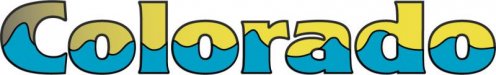
BTW, what font is that, tiki?
Brandon708
New Member
TIKI you nailed it. great job.
I like that you can get your logo designed for free on this site. lol
I like that you can get your logo designed for free on this site. lol
10sacer
New Member
Logo
Colorado,
I finally figured out what caught my eye first.
The middle left one looks like a pregnant woman laying down. Perhaps I am just geared that way. Anyway - I wouldn't mix the jagged peaks with a rounded hill - confusing.
Everything on the right is hard to read. Wrong font choice.
I like some of Pat's ideas better
JMO