• I want to thank all the members that have upgraded your accounts. I truly appreciate your support of the site monetarily. Supporting the site keeps this site up and running as a lot of work daily goes on behind the scenes. Click to Support Signs101 ...

New T-Shirt Designs

Idea Design

New Member
I sometimes get tired of looking at the same tshirts that we wear day after day.

So I decided to design a couple of new ones. I've always wanted to have two or three different shirts so I'm never not in a company shirt.

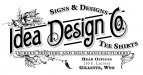
I love to look at the old stuff from the 30s and 40s era, so that's where the obvious old-school design came from.

The other is just a simple layout with my logo lettering rearranged and then ran through the Mister Retro Machine Wash filter.
 

Attachments

  • platestyle_3.jpg
    platestyle_3.jpg
    98.7 KB · Views: 130
  • retro3.jpg
    retro3.jpg
    136.4 KB · Views: 103

Flame

New Member
Cough cough....gomedia.

haha.

First one dude....the 2nd looks a lil too drab. For a t-shirt anyways. The 1st has color and a lil better feel, just too linear imo. But either are better than most I see cranked out....
 

signgal

New Member
Hey! I love the second one... it's one of those interesting, classic shirts a person would wear even if they didn't know who the heck you are.
 

Bannerday

New Member
Both look good to me but I would prefer a web address or phone to your physical address.


It makes it easier for people to contact you.
 

blueben

New Member
I like both. Its always nice to have options to wear. The second one reminds me of the shirt shop I usually use in Flagstaff. I have seen a lot of the college kids up there wearing their shirts because of the vintage look of it and not even knowing who or what the company was.
 

Patrick46

New Member
I like the second one alot!

I'm really into the 'classic' designs...and love signwork from the 30's.


heck...how much do ya want for one??
 

mikey-Oh

New Member
the second one, especially if it's printed in something other than b&w. small world, my dad's working in gillette, wy right now
 

bob

It's better to have two hands than one glove.
I like the second one alot!

I'm really into the 'classic' designs...and love signwork from the 30's.

Then you really ought to know that the one you seem to like is representative of the era around the turn of the century. Certainly before 1920. The 30's was far more art deco and big solid heroic looking stuff. Almost an ugly a time as the 1950's.
 

Idea Design

New Member
heck...how much do ya want for one??

This reminds me of a thread where we talked about trading shop shirts with our comrades here on 101. We could have a thread dedicated to pictures of people taken in someone else's shop shirt.

I always thought it was a grand idea, but didn't think my shirts were worth trading. I think we should revisit this idea.

I started at post #23.

http://www.signs101.com/forums/showthread.php?t=37234

small world, my dad's working in gillette, wy right now

I'm going to guess something to do with the new power plant or in the oil and gas fields... am I right?
 

signswi

New Member
The second one is nice, especially if printed on a distressed t-shirt. The first would be better without the flourishes, though the "screen printers..." line and the address typography need some work.
 

Idea Design

New Member
Thanks for all the replies. I actually made the screen for the old school one yesterday. I didn't do the distressed thing on it, though, and I made it into a one color job by half-toning the shadow areas.

Hopefully I have a shirt at the shop that will work for a test print, then we will move on to some of the color suggestions here.

I bought a quart of Union ultrasoft Texas Orange some time back and was thinking that might look pretty good on a sandstone color. We'll see.

I'm curious to see the actual result with it being only a one color print. If I get a shirt printed today, I'll post up a shot of it.
 
Top