-
I want to thank all the members that have upgraded your accounts. I truly appreciate your support of the site monetarily. Supporting the site keeps this site up and running as a lot of work daily goes on behind the scenes. Click to Support Signs101 ...
You are using an out of date browser. It may not display this or other websites correctly.
You should upgrade or use an alternative browser.
You should upgrade or use an alternative browser.
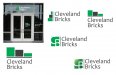
Discussion Not a brick company...
- Thread starter Marco
- Start date
Bradley Signs
Bradley Signs
Um..... maybe a cityscape or house type shape made of blocks? The shape will say a lot about who they are. Just a thought. Good luck.
Marco
New Member
Yep, I agree, but so many have taken home and building line sketch direction. The brick may confuse folks even more. ??Um..... maybe a cityscape or house type shape made of blocks? The shape will say a lot about who they are. Just a thought. Good luck.
Fred Weiss
Merchant Member
How about pictograms of open land, a house and an apartment building ... none made of bricks.
Modern Ink Signs
Premium Subscriber
Why not add what they do!?
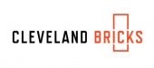
Cleveland Bricks says nothing about what they do.
Just a thought
Cleveland Bricks says nothing about what they do.
Just a thought
Johnny Best
Active Member
skyline, browns color and simple type and agree with Visual

signbrad
New Member
Why not add what they do!?
Cleveland Bricks says nothing about what they do.
This is a good point. If you want the sign work to help explain what the company's activities are, simply add some secondary information. The logo itself does not need to tell the story. The logo does not need to contain visual clues describing a business. It can, but it does not need to.
Selling, describing, advertising—this is part of marketing. Not logo design.
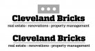
For example, simple tag lines can be added to help sell/explain:
"Design-Build-Renovate." Or, "Real Estate & Property Management."
But even tag lines can be cryptic:
"We Sell Perfection." Or, "Pursuing Excellence."
Corny? Tag lines, like logos, do not need to be at the top of the clever-meter. Yes, some can be cute. But it's more important that they be fairly simple and memorable. Don't make viewers work too hard (many of the principles in Steve Krug's book Don't Make Me Think apply aptly to sign work, though he was writing primarily about web design).
Sometimes We Can Try Too Hard
Sometimes we in the sign world try too hard when it comes to logo design. A business usually does not need to be explained by a logo. To expect a logo to tell the company's story, especially if the business is a multi-faceted one, engaged in a variety of activities, is an almost impossible task. We can easily paint ourselves into a corner when we try to design a logo. Sometimes we produce a design after lots of sweat and angst, but it's too complicated and impractical.
One of the most innovative, far-flung companies in the world is 3M. The company's reputation for excellence and diversity is unrivaled. Their corporate logo cannot possibly tell their story by its design. But it doesn't try to. It is Helvetica heavy, in red. It is devoid of any design treatment other than that the characters touch.
A logo does not necessarily make a company look good. It's more often the other way around.
When a company dies, it's not because of the logo. A company dies on its own. Its logo, even if it's well designed, doesn't save it. It dies too. (Think: Enron).
Paul Rand said, "Should a logo be self-explanatory? It is only by association with a product, a service, a business, or a corporation that a logo takes on any real meaning."
The chairman of Chase Bank is said to have hated the blue octagon logo when it was designed for Chase over fifty years ago. Reportedly, he said, "Well, what the hell does it mean?" But soon he was wearing octagon logo cufflinks.
Nike executives weren't happy with their swoosh in the beginning. But it has become wildly successful. Because of design genius? No. Rather, it was due to marketing. If the Nike swoosh were designed today, what would people say? I can hear them say something like, "What's that got to do with shoes? It doesn't mean anything!" Or, "Hell, my eleven-year-old daughter could have done that!" And it would be hard to argue with those comments.
...............
Characteristics of Good Logo Design
Here are some characteristics of good logo design:
Simple (usually, but not always)
Memorable (always)
Attractive (helpful)
Flexible (important)
..............
From a legal standpoint, a fanciful (nondescriptive) logo can, with time, be very strong. It can be stronger, and more protectable as a trademark, than a descriptive logo. Apple Computer's apple logo is a strong trademark because it has no apparent connection to computers. It has no built-in meaning or symbolism, notwithstanding urban legends to the contrary. It is a simple play on words. Nothing more.
Regarding the name Cleveland Bricks, my own opinion is that it's a cool name. The company deals with things that are built. "Brick-and-mortar structures." They design them, build them, fix them up, sell them, maintain them. In time, any one of these activities could become associated with this company name in a major way.
Will the word "bricks" create consumer confusion? Good advertising will prevent that. The slight quirkiness in the name may even make it more memorable. Besides, when people speak of "brick-and-mortar" companies do they think only of businesses that occupy masonry buildings? No. The term has taken on a secondary, nonliteral meaning. A brick-and-mortar business is a business that has a physical location with a front door you can walk through, as opposed to an online-only business where you access it through a landing page.
The name Cleveland Bricks is simple, easy to remember. It almost sounds as catchy as a baseball team name. Or maybe not. I prefer Indians over Bricks, though Bricks is less politically charged.
")
Cleveland Bricks could eventually come to acquire a reputation for excellence as a property management company. Or a premier renovator. Or an innovative design firm. If they are lucky, they will have a good name in all of those things. But it will take advertising, marketing, a string of happy customers—and time. A really "hot dog" logo is not really going to do it.
Having said all of the above, it almost sounds as if I believe logo design is unimportant. Not true. Logo design is important. Design is important. I don't mean to make light of it (it's my job, after all).
But I have smiled at times when reading about all the symbolic meaning that some logo designs are supposed to contain. Do viewers see all this stuff subconsciously when they look at a logo? Hmm... It seems more likely that much of the symbolism is to help sell the design to the logo buyer. Or it helps justify a high design charge in the inquiring minds of shareholders. I know that if I could charge six figures for a logo design I would make sure it had a LOAD of symbolism.
Paul Rand charged Steve Jobs $100,000 for creating a brand identity that included the NeXT logo design. Included was a 20-page brochure.
Overpriced? Is a 53-million-dollar athlete overpriced (Cam Newton)?
Is Roger Federer more overpriced at 67 million? Lebron James makes over 77 million. Surely Cristiano Ronaldo is way overpriced at 88 million. I mean, who is he, anyway?
A design is potentially worth far more than any athlete. The Coca-Cola trademark is an asset with an estimated worth of 70 BILLION.
If I could charge 100 grand for a logo I would most certainly do it. It would be highly symbolic, of course, filled with meaning. And it would include a detailed brochure. I would also throw in a pizza!
Marco,
Just make a nice design and don't overthink it too much. And have fun. What you have done already looks fine, though I must admit that I didn't see the two negative-space letters in the green icon at first; all I saw were the green shapes. I knew there was something in the icon but it took me a minute to see the letters. I see them instantly now. But I didn't at first. Tweak it? Make the negative-space letters bolder so they overpower the green shapes more? Show more of the letter profiles, maybe? Or leave it alone? Come to think of it, I still don't see the arrow right away in the FedEx logo, even after all these years. I have to look at it for a second. Give Cleveland Bricks another design option if you want. But I never do more than three. Interestingly, when Paul Rand was asked by Steve Jobs to submit logo options, he is reported to have said, "No. I will solve your problem for you, and you will pay me..."
Brad in Kansas City
A blog post from last year on this subject:
Does a logo design need to tell a story?
Johnny Best
Active Member
I think people who come on here with logos have taken Paul Rand's advice to Steve Jobs on the NeXT logo he designed for him "If you want options go talk to other people". Everybody likes to give their options on logos on how to handle it a better way as shown here. I think from now on I will need a gift certificate for a pizza like signbrad suggested before I even draw something out which they won't use it anyway because they think their attempt is a better idea and signbrad liked it so your all set.
Last edited:
Johnny Best
Active Member
I like Jets Pizza

signbrad
New Member
Everybody likes to give their options on logos on how to handle it a better way as shown here.
True. We all benefit when others share design ideas and tweaks here. It adds to the fun of designing to see what others do. And many here have offered some kick-butt design examples during the short time I've been coming here. I hope my comments aren't seen as discouraging anyone from giving, or asking for, design advice.
I also appreciate advice on how to charge what our work is worth. While many of us work hard to improve our design ability, I think many of us also struggle with making a living in an increasingly competitive industry. If the bar for what is acceptable as good design has been lowered, the standard for what our time is worth has been lowered even further.
We need more 100,000 dollar design jobs.

Johnny Best
Active Member
Johnny Best
Active Member
Moving in the right direction.
NazGraphics
New Member
very niceView attachment 130972 Sunday morning coffee