• I want to thank all the members that have upgraded your accounts. I truly appreciate your support of the site monetarily. Supporting the site keeps this site up and running as a lot of work daily goes on behind the scenes. Click to Support Signs101 ...

Police Car Design

stephenj148

New Member
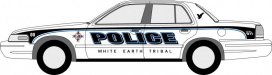
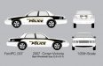
Looking for some critiques, tips, tricks, opinions...whatever you guys have to help me out with this design. They are looking to dress up the new cars, but with a simple design. Still need to add the police patch to the front fender of the car, still working on that part.

Thanks in advance for the comments.
 

stephenj148

New Member
whooops...would be helpful if I posted the picture.... :doh::doh::doh::iamwithstupid
 

Attachments

  • ELPD_CAR_OPTION_1A.jpg
    ELPD_CAR_OPTION_1A.jpg
    42.4 KB · Views: 97

Marlene

New Member
I like it. it's a modern looking way to do a black & white cop car and it looks good. it's simple yet interesting
 

ddubia

New Member
We did ours as these pics show. Our cars are painted as Black & Whites.

The Chief wanted a gradient on the "POLICE" copy. Badge is small on the front fender. They also wanted to promote the city's web address on the back. The "EMERGENCY" is vinyl while the white "911" is reflective.

It's a simple and quick install.
 

Attachments

  • 2009-Alliance-Police_rear.jpg
    2009-Alliance-Police_rear.jpg
    73.6 KB · Views: 82
  • 2009-Alliance-Police.jpg
    2009-Alliance-Police.jpg
    38.8 KB · Views: 89

SignosaurusRex

Active Member
The first thing that I notice is that you have not taken into consideration for the Door mouldings. While some graphics are sometimes installed over mouldings, the lettering itself is seldom positioned so. Most police crown vic's come without the front mouldings installed but all have the rear mouldings pre-installed at the factory. They conceal large access holes in the rear doors so removing them is not an option. Additionally, IMO the text should be larger and positioned higher in the doors. Any text positioned too low on the car, especially (crown vic's) will actually look even lower on the car once installed.
 

Jillbeans

New Member
The font is really lackluster.
I would have chosen something more extended for POLICE.
However, I do really like the rest of the car.
Love....Jill
 

stephenj148

New Member
Thanks Rex!

I was told the moldings would possibly be removed from the car before we get it. So I was designing on that idea of it. I will move up the text, as well as make it larger. Moldings or not, I see what your saying how it will appear lower
 

stephenj148

New Member
The font is really lackluster.
I would have chosen something more extended for POLICE.
However, I do really like the rest of the car.
Love....Jill

Have anythings specific for an extended font to use? That was simply a helvetica. I'm not to crazy about it either.
 

SignosaurusRex

Active Member
I think the size of EAST LYME is okay but as Jill said, the font should be something more extended. One poplular font for police units is SERPENTINE. Other choices might be Eurostle bold extended, Bolt bold, Handle bold, Machine bold extended....
 

Jillbeans

New Member
Please no Serpentine, that and Banco are two of my least faves.
Not that it's my police car.
But they look so 90s to me now.
 

BRUSHMARKS

New Member
No actual pictures, but here is the design we have done on roughly 3-45 cars in last 6 years. your design made me think of ours because of the graphic stripe
 

Attachments

  • 2003 CAR.jpg
    2003 CAR.jpg
    31.5 KB · Views: 111
Top