-
I want to thank all the members that have upgraded your accounts. I truly appreciate your support of the site monetarily. Supporting the site keeps this site up and running as a lot of work daily goes on behind the scenes. Click to Support Signs101 ...
You are using an out of date browser. It may not display this or other websites correctly.
You should upgrade or use an alternative browser.
You should upgrade or use an alternative browser.
Possible Company Logo?
- Thread starter tonywhittier
- Start date

Locals Find!
New Member
I don't like those squiggly lines you got going on looks like my kid through spaghetti at your logo while you were drawing it.
Lose the squiggles.
Lose the squiggles.
shakey0818
New Member
Looks real nice i like it.
tonywhittier
New Member
Adtechia LLC - I can kinda see that LOL
Mike Paul - Very much so, I live in racing county USA here in North Carolina, so I guess you can say I'll be catering to that kinda crowd.
Mike Paul - Very much so, I live in racing county USA here in North Carolina, so I guess you can say I'll be catering to that kinda crowd.
SignStudent
New Member
The green outline around the sub copy kinda bothers my eyes. I think it might help to either put a drop shadow on that too or just remove the green from that part.
GAC05
Quit buggin' me
Looks good to me too.
If it is going to be a logo get rid of the 2 lines on the bottom or at the least pull them down to give the main copy some breathing space.
All in all good stuff, I do wonder how hard it will be to hit that almost neon green on some printers.
wayne k
guam usa
If it is going to be a logo get rid of the 2 lines on the bottom or at the least pull them down to give the main copy some breathing space.
All in all good stuff, I do wonder how hard it will be to hit that almost neon green on some printers.
wayne k
guam usa
tonywhittier
New Member
Thanks everyone for the awesome criticism! I will be making some changes of course, but after looking at this thing for a while you start to lose ideas and that's why I'm glad I posted it here.
Keep it coming!
Keep it coming!
Locals Find!
New Member
Try changing the squiggles to something like barb wire. That would fit better with the name and get the effect I think your were actually trying for.
phototec
New Member
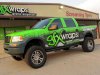
Here's a little something I threw together for a possible company logo (website is not up)...tell me what you think!
Looks close to GFX Wraps color & scheme?

Attachments

tonywhittier
New Member
Looks close to GFX Wraps color & scheme?
That does look real close...buttttt he's in Texas and I'm in North Carolina, so it should be ok. :Oops:
omgsideburns
New Member
wicked
10sacer
New Member
Are you going to concentrate solely on the racing world? If so in this area - you best be prepared to not make a whole lot of cash. There are 5 or 6 major vendors who have the NASCAR market tied up (remember there is a finite number of cars available) and any of the lesser teams or lower classs race series will end up trying to barter your work for ad space or draw you out past 180 days to get paid.
I don't do any work for the Speedway anymore because I am not a bank and can't float that kind of cash anymore for as long as they will take to pay.
You are going up against Mortorsports Designs, ProCal, Decal Source, Red Eye Designs and several other smaller places around here.
Anyway, logo is fine and good luck.
Marlene
New Member
there seems to be a look for this type of business and what you did is fitting. it's like you epxect to see a skull and rose on every tatoo shop sign, red and yellow on every Chinese restaurant and what you did on every wrap shop. that isn't a bad thing as it does tell the public what and who you are very clearly.
GoodPeopleFlags
New Member
The 2 lines on the bottom are not part of a logo. A logo is a logo. The lines at the bottom are things you add.
You're not using the marbley looking background as part of the logo, right? It would be fine for the background of a biz card but not for letterhead or shirts.
Other than those things, I like it.
You're not using the marbley looking background as part of the logo, right? It would be fine for the background of a biz card but not for letterhead or shirts.
Other than those things, I like it.