-
I want to thank all the members that have upgraded your accounts. I truly appreciate your support of the site monetarily. Supporting the site keeps this site up and running as a lot of work daily goes on behind the scenes. Click to Support Signs101 ...
You are using an out of date browser. It may not display this or other websites correctly.
You should upgrade or use an alternative browser.
You should upgrade or use an alternative browser.
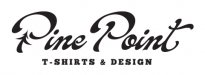
Potential or Trainwreck?
- Thread starter HaroldDesign
- Start date

Jillbeans
New Member
It's not bad but it's confusing.
I'd try moving the tree/cabin graphic to the left, losing the banner, and putting TEES & DESIGN underneath Pine Point.
(I think I'd even consider adding T-Shirt Designs instead)
Tees makes me think of golf tees?
I don't like how the tree interferes with the pretty script.
Love....Jill
I'd try moving the tree/cabin graphic to the left, losing the banner, and putting TEES & DESIGN underneath Pine Point.
(I think I'd even consider adding T-Shirt Designs instead)
Tees makes me think of golf tees?
I don't like how the tree interferes with the pretty script.
Love....Jill
WildWestDesigns
Active Member
It's not bad but it's confusing.
It was for me.
I'd try moving the tree/cabin graphic to the left, losing the banner, and
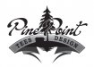
I'm not to sure about having the cabin in there. I think the pine is alright, but the cabin just makes me think of something else.
putting TEES & DESIGN underneath Pine Point.
(I think I'd even consider adding T-Shirt Designs instead)
Tees makes me think of golf tees?
That's exactly what I was thinking.
HaroldDesign
New Member
Thanks Jill. Since I have one just like you mentioned I'll probably lean towards that route. I have a lot of versions. This particular one I reached that certain point where I began to wonder if time into details was a good idea or not. Maybe I'll post some of the other ones, too.
TyrantDesigner
Art! Hot and fresh.
The tree and the 'P' in point blend too much visually. Is the name Pine Point Tees Design? or is the name Pine Point and you do 'Tees' and 'design' work?
I do like the cabin and tree breaking in from the bottom, just don't like the 'reflection' ... just round the black design out on the bottom and it should be fine.
Other than that ... not much I can say about it. lets see some color combos too.
I do like the cabin and tree breaking in from the bottom, just don't like the 'reflection' ... just round the black design out on the bottom and it should be fine.
Other than that ... not much I can say about it. lets see some color combos too.
HaroldDesign
New Member
This is great feedback guys. Not sure how soon I'll be able to make some changes and post some other concepts, but you're all giving me some great suggestions & opinions to give me some direction!!!
HaroldDesign
New Member
:ROFLMAO: I like it...Or you could make a tee shirt with two "points" in it like a cold person was wearing it.
HaroldDesign
New Member

sar bossier
New Member
I like the 2nd one MUCH better, but lose (or extensively modify) the banner. I like the pine tree without the cabin.
HaroldDesign
New Member
Have work to do so I can't jump on it, but I'm looking forward to sketching what's coming to mind with all these suggestions! Also, I know people like toying with ideas and posting them to help out. I would prefer you didn't, or at least wait until I post various versions I've already come up with. I have a feeling someone may post something much like I've already done, and it could appear in the end that I took someone's work.
ucmj22
New Member
Have work to do so I can't jump on it, but I'm looking forward to sketching what's coming to mind with all these suggestions! Also, I know people like toying with ideas and posting them to help out. I would prefer you didn't, or at least wait until I post various versions I've already come up with. I have a feeling someone may post something much like I've already done, and it could appear in the end that I took someone's work.
lol . these last couple days have really got people on edge

Pat Whatley
New Member
Okay, confused me, it didn't make any sense. I didn't associate "TEE DESIGN" and a scenic picture with t-shirts, all I could think of was a landscaper on a golf course.