-
I want to thank all the members that have upgraded your accounts. I truly appreciate your support of the site monetarily. Supporting the site keeps this site up and running as a lot of work daily goes on behind the scenes. Click to Support Signs101 ...
You are using an out of date browser. It may not display this or other websites correctly.
You should upgrade or use an alternative browser.
You should upgrade or use an alternative browser.
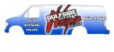
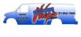
Shop van design critique
- Thread starter modernmav
- Start date
Jim Doggett
New Member
here is all i have so far on a from scractch version taking in some of your suggestions, having trouble coming up with something more for the yellow background to match the main image...
Way better! Black background instead of yellow? My $0.02.
Jim
artsnletters
New Member
to me, the word "Wraps" is too illegible. it just kind of forms a big blob of shapes moving thru "Gulfport" and the copy under that. You know that the word is Wraps, but will the customer seeing it in a split second going down the road?
Tim
Tim
CL Graphics
New Member
go with post 18.
Malkin
New Member
I didnt want to do a black background because we want something thats going to be bright and eye catching, at least that was the idea behind it?
Ask yourself, do you want the logo bright & eye catching or the background bright & eye catching?
If they both are, than the eye cannot quickly distinguish what it sees, and the message is lost. Remember your audience only sees it for a few seconds, not hours like you do.

")