• I want to thank all the members that have upgraded your accounts. I truly appreciate your support of the site monetarily. Supporting the site keeps this site up and running as a lot of work daily goes on behind the scenes. Click to Support Signs101 ...

Signage from the 1930's, any ideas?

MrTopgun21

New Member
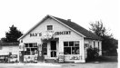
This store is my buddy's dad's old gas station, built in the 50's. His son is opening an outfitter's store in the same building and wants to use the same or similar font for his store.
I KNOW I've used this font in the past and for the life of me, I can't remember the name of it. I've looked through 3 font websites, and a few come close (Baggy, Cooper, New Spirit)
Does anyone have an idea? Thanks for your help.
 

Attachments

  • Sharps-51-lightened.jpg
    Sharps-51-lightened.jpg
    95.1 KB · Views: 351
  • dads-signage.jpg
    dads-signage.jpg
    19.6 KB · Views: 226

Boudica

Back to "educational purposes"
those letters look like they were cut out by hand. - the "D"s don't match nor do the "R"s. Just pick something close. I vote Cooper.
 

Gino

Premium Subscriber
Just someone's version of cooper black. Whether they were painted directly on or cut outta wood, to match that will be tough, cause you'll hata bastardize the font. Yours will most likely look better. I'd put it on a board of some sarot and have them attach it.
 

AndersHerp

Something, something Dark Side
I would custom make the font, plot all the points and curve the lines to closely match it up. I think the point of what they want isn't an actual font but more of what is a noticeably hand drawn font. It will have more playful feeling to the sign, but that is just my 2 cents.
 

Billct2

Active Member
When I was learning how to letter I loved fonts like that, no square corners or edges. I would start with something like Cooper, but a search may come up with something closer. And then modify.
The beauty is it doesn't have to be "letter perfect".
 

bob

It's better to have two hands than one glove.
That's just some rather mediocre sign painter's hand. It looks like he was going for Cooper Black but lack the skill to pull it off. Don't curse your friend by trying to imitate some else's really crappy hand. Just go for the Cooper Black.
 

Billct2

Active Member
Why is reproducing a historical design a "curse"? I think just slapping computer perfect Cooper letters would be the crappy look.
I've done historic race cars and always match the vagaries of the original hand lettered design as closely as possible.
 

Gino

Premium Subscriber
This is a very interesting subject. Would anyone want to take it up.... in a new thread ??
 

Bobby H

Arial Sucks.
Cooper Black has been done to death. If I was going to go with anything related to the Cooper families I'd go with Cooper Poster or Cooper Old Style:

New Spirit by Newlyn looks like a mix of Cooper and Windsor. It has several regular and condensed styles:
 

MrTopgun21

New Member
I agree after I posted this, I thought Cooper Black would work. Thanks for all of your comments, they've been an interesting read. :)
;)
 

Stacey K

I like making signs
I think it would be cool to do these by hand so each letter is a little different. Use the original letters as inspiration. Hope to see you come back and update us with the final version!
 
Top