-
I want to thank all the members that have upgraded your accounts. I truly appreciate your support of the site monetarily. Supporting the site keeps this site up and running as a lot of work daily goes on behind the scenes. Click to Support Signs101 ...
You are using an out of date browser. It may not display this or other websites correctly.
You should upgrade or use an alternative browser.
You should upgrade or use an alternative browser.
simple design for 12' wide 6' high sign
- Thread starter chuck2302
- Start date

Rick
Certified Enneadecagon Designer
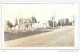
Have a friend who has a sign board by his resort. He's looking for a simple easy to read lay out. Any suggestions to this simple design? I was thinking background color but it won't be lit up. So white will show longer in twilight
Anything to try to fix this layout would be like polishing a turd, the whole thing needs to be redone...
J Hill Designs
New Member
Anything to try to fix this layout would be like polishing a turd, the whole thing needs to be redone...
I dunno, rick. I can read 'wifi' pretty durn good from the thumbnail!
Rick
Certified Enneadecagon Designer
First thing I see is...
This place has a history, seems like no one is respecting that... I look at old images of this place and it had some decent signage for the time. Then for some reason, it ends up like that mess... this sign is huge for that kind of ugly.
If I were you, watch this video UNLESS YOU ARE EASILY OFFENDED!!!!
[video=youtube;b9N3yj3gOck]https://www.youtube.com/watch?v=b9N3yj3gOck[/video]
Think about what you are designing to... something with history and heritage as this place doesn't look like it changed much, except for the cheesey plastic chairs outside. My idea only took a few minutes. I get that fishing is big there, but does it have to go on the sign? Isn't that what marketing materials are for... or flag banners? If it HAS to go on the sign, make sure it's appropriate for people viewing it at speed.
Attachments


SignProPlus-Chip
New Member
Rick Nails it.
The layout there with the comics sans and Blambot Comic Fonts....just terrible. Blambot fonts are great, for COMICS (Nate Piekos does fine work and is a great resource for the comic industry), just not here, ditch them for something more suitable.
The layout there with the comics sans and Blambot Comic Fonts....just terrible. Blambot fonts are great, for COMICS (Nate Piekos does fine work and is a great resource for the comic industry), just not here, ditch them for something more suitable.
Jean Shimp
New Member
Go Draplin!
First thing I see is...
This place has a history, seems like no one is respecting that... I look at old images of this place and it had some decent signage for the time. Then for some reason, it ends up like that mess... this sign is huge for that kind of ugly.
If I were you, watch this video UNLESS YOU ARE EASILY OFFENDED!!!!
[video=youtube;b9N3yj3gOck]https://www.youtube.com/watch?v=b9N3yj3gOck[/video]
Think about what you are designing to... something with history and heritage as this place doesn't look like it changed much, except for the cheesey plastic chairs outside. My idea only took a few minutes. I get that fishing is big there, but does it have to go on the sign? Isn't that what marketing materials are for... or flag banners? If it HAS to go on the sign, make sure it's appropriate for people viewing it at speed.
Snobby, arrogant, mother#$%^ing graphic designer. You just stripped all the local charm out of it and gentrified the whole thing. Instead of nightcrawlers and a 12 pack of Bud, folks will now come in looking for lattes and a crisp, not too oakey chardonnay. LOL
SignManiac
New Member
So the guy isn't a cracker jack designer. He asked for suggestions or help to improve it. Rick is the only one who made an effort. The rest of you slamming the guy should put up your stuff before spouting off.
Chuck... Do some research on previous design threads. Plenty of good advice in those. You do have a lot to learn about design and can learn at least the basics, if you focus your study on that part of the business. Rick made excellent points about the purpose of good design. Making an effective sign is no accident a lot more then sticking letters on a board. Those of us here who have devoted our lives to sign design can pick out the obvious mistakes in yours. Font selection, layout, contrast, size, spacing, negative and positive space, kerning are just a few of the issues that need to be addressed when laying out a sign.
Take all the advice with a grain of salt, but invest some time in learning how to create a good looking sign. Otherwise you are just competing with all the other rubbish out there.
Prioritize the most important thing on the sign. Don't rely on unnecessary outlines or special effects. Contrast is your friend as well as legible fonts.
Although I didn't put more than twenty minutes into this and didn't take into account any specific guidelines, it just illustrates what you can do with all the above things I mentioned. And this is probably not what I would have designed if I were doing it for the client. Once I knew more about their business, I would come up with something very design specific and with real purpose. This example just demonstrates prioritizing the message. I could go on and on about the psychology of the design process but this should give you plenty to consider.
An important thing to remember, is don't always do what your customer wants. Because if you leave it up to them, they will want too much on the sign. It's up to you to decide what is absolutely important for the sign. Remember, less is more when it comes to signs. The hardest thing for you to overcome is convincing them of that. There are ways to do that too, but in time you will learn how to control the interview and design process.