-
I want to thank all the members that have upgraded your accounts. I truly appreciate your support of the site monetarily. Supporting the site keeps this site up and running as a lot of work daily goes on behind the scenes. Click to Support Signs101 ...
You are using an out of date browser. It may not display this or other websites correctly.
You should upgrade or use an alternative browser.
You should upgrade or use an alternative browser.
Thoughts on this design???
- Thread starter JManes7
- Start date
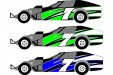
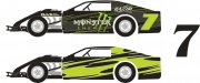
Okay, so I just changed the numbers since im at school, and didnt have the original file on my flash drive. The top number is a spin off of Jared Landers 777 number...and the bottom is Clarendon like Jill suggested. I added the blue because I thought it might break up the green and white. Is this any better?
Attachments
702 graphics
New Member
Green on a racecar? Might as well have it sponsored by planters, KFC, and change the number to 13!
ericmitchell29
New Member
Definitely top number. Bottom number isn't a racing font.
That green thing is funny. I knew guys when I raced that wouldn't let their family leave the house on race day until they saw that every last kid didn't have any green on.
But... some notables...
Bobby Labonte won the championship in the Interstate Batteries Car.
Harry Gant back in the day with Skoal won alot.
Kyle Busch, wins all the time.
I dunno, maybe it just applies to the small timers.
That blue and green isn't working together though. .
Go with neon orange with that green and You'll be ok.
Lose the blue, I don't think it works with the green/black/white combo. It makes the number look like it was thrown on top of the design vs. being part of the design. One of the hard parts of design and something I fight daily is how to make multiple items "play nice" with each other while having some items draw more attention than others.
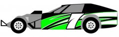
I'm not extremely familiar with late models but is there a way to move the number forward to where it is more centered under the opening (where the window would be)? I think it would look better plus it give you a little more breathing room on installation. If the number is right against the wheel well you leave no room for error. If your vinyl ends up off a small amount, it might cut off part of your number.
Allen
Custom Bob
New Member
From someone that has done hundreds of race cars......The graphic design has been used over and over the last few years on race cars. "yawn"
The bold 7 looks best, but put more angle to it.
Try blue instead of the white in the graphics with a 1/4" white border stripe on the green and blue. Add 1/2" stripes of lighter green and blue just inside the white border stripes.
Make the number white and maybe some gradient with grey or yellow in the number. Make the shadow and outline black with a 1/2" prism outline around it.
intensegraphics
New Member
IMHO the background graphic has too much "bulk" to it, if that makes any sense? I agree you need to get something that flows up into the sail panel. Attached are an image of a car I did for my nephew last year (kinda beat up in the pic) and an example of the background in green. Also a number 7 that we have used in the past that flowed well with the designs we were using at the time.
I am no expert (as you can see). Only do one or two cars a year because I've come to find that racers are a PITA when it comes to doing their cars")
Just my personal preference.... Good luck!
I am no expert (as you can see). Only do one or two cars a year because I've come to find that racers are a PITA when it comes to doing their cars
Just my personal preference.... Good luck!
Attachments
Still use Brushes
New Member
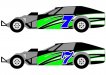
The layout you have there is what we call the E-MOD Division. What's throwing it off for me is all the gray in the wheelwell area and the windows. Try dropping that out, use the top 7 of your second design with a Gun Metal Gray Diamondplate design with a black, bold, but not overpowering, outline. Worth a look see.