• I want to thank all the members that have upgraded your accounts. I truly appreciate your support of the site monetarily. Supporting the site keeps this site up and running as a lot of work daily goes on behind the scenes. Click to Support Signs101 ...

Thoughts on this layout

sinetist

New Member
I had to use this new letter style to see what it would look like

Well, I like that font .... but not for there. Something solid/classic/dependable looking is what I'm thinking for that part of the name. The compass behind the mountain is a possibility though it's moved from the forefront to the far background. I like the font you used on the first sports & clothing. I was just looking for it through my font book. I know I have it on one of these many disks I've got.
 

luggnut

New Member
i don't like text that is skewed, angled or arched for no reason... like when people ask to arch there name on the side of their van with nothing below the arch. the skewed or arched text here needs something to give the angles reason... or just do it straight.

you could adjust the sign shape to make the angles make sense or add some elements... here are some pics from golden era studios panels that show how the text and the shapes work together. i know these are period pieces and decorative but the concepts are the same. like the americana has the arched bottom but the eagle art makes it almost a necessity and the first panel on the page has angled text that works with that panel.


by the way the golden era studios stuff is awesome... can make me look like a genius on signs that call for it.
 

Attachments

  • americana.jpg
    americana.jpg
    48.8 KB · Views: 98
  • page3t.jpg
    page3t.jpg
    57.4 KB · Views: 97
i like the direction Day Sign Co is going in the first sample they posted. the angle concept that the OP is trying to incorporate just isn't working on this one for me.

Yes Lugg I love all of Mike Jackson's collections top notch stuff...and he is a heck of a nice guy on top of it.
 

sinetist

New Member
I love Mike Jackson's work also but so far I've never been able to interest a customer in that kind of style. Day Sign Co's first contribution is my favorite even if the compass for the O has been dropped (that was the client's first thought on what they'd like in their design).

Luggnut, the concept of no distortions without a reason is a good one that I'll keep in mind.
 

Gino

Premium Subscriber
I like many of these suggestions as to the layout, but none of them say '3D' look to me. When we do sandblasted or carved signs.... they generally have a unique shape. By unique, I don't necessarily mean crazy like-all over the place, but not just a rectangle. This looks more like a regular flat type of sign layout for MDO or aluminum…. or even a backlit.

With relief signs… we tend to make the style do the work and keep the layout somewhat simple. We like to show off the beauty of the wood and the technique being used. That all goes into the designing, unless someone gives us straight forward directions, thren we do as told, collect our money and say goodbye.

Anyway, I’m not at my shop computer or I’d post up a picture, so suffice it to say…. you’ll just have to imagine what I’m talking about. :wink:
 

rjpjr

New Member
i don't like text that is skewed, angled or arched for no reason... like when people ask to arch there name on the side of their van with nothing below the arch. the skewed or arched text here needs something to give the angles reason... or just do it straight.

I agree with this.

My initial impression when I reviewed the original post... the text skews and angles were clashing and not complimenting each other. I think the full compass hurts the legibility as well.

I liked the mountain range idea that Day Sign introduced.
 

Attachments

  • North-Road-Sports-and-Clothing-2.jpg
    North-Road-Sports-and-Clothing-2.jpg
    36.3 KB · Views: 113
  • North-Road-Sports-and-Clothing-3.jpg
    North-Road-Sports-and-Clothing-3.jpg
    34.6 KB · Views: 107

sinetist

New Member
Gino I get what you're saying. In this case I have to make the sign a rectangle to fit a certain spot.

On Saturday my wife and I drove to another city for an night away and on the drive there and back I was paying particular attention to lettering distortions, and any reasons for them, on all the signs we passed. Of course, being in the business I'm always looking at signs but this time I was concentrating on that aspect of them. Of the thousands of signs I looked at there was only about a half dozen that had any noticeable distortions. Of those, on only one could I truly say that the distortion had no reason for being. The exercise was quite enlightening.

I think the reason for my original distortion was to impart a sense of movement (not necessarily perspective). I'm still after that in the attached new take on a layout (though I'm still tempted to go with something close to Day Sign Co's contribution).
 

Attachments

  • Picture 2.png
    Picture 2.png
    62.3 KB · Views: 103

sinetist

New Member
Wow ... a couple more very nice layouts from rjpjr posted while I was typing my last reply. More food for thought. Thanks for contributing.
 

Mike Jackson

New Member
Wow, it's been close to 15 years since we did any sandblasting. Time flies!

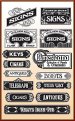
I'll throw in a couple of comments (2¢ worth). I would be a bit worried about the effectiveness of some of these layouts on a sandblasted sign, especially one that held a lot of grain in the background. Many would work fine if one a flat surface. For the most part, you have either raised areas or blasted areas. Positive or Negative so to speak. If you have the budget, you can always add raised letters or raised graphics to get another dimension, but some of the layouts I see above back you into a corner. If there are letters over a mountain or another graphic, you have to figure out how you are going to deal with it on a dimensional sign.

Also, despite all the whiz bang elements you might consider adding, you still need to consider contrast values when everything is finished. With light colored (and yellow) sandblasted backgrounds, you end up with quite a bit of shadows in the blasted areas and that can drop the value down quite a bit. It will not really be bright yellow, but a darker shade of yellow. Keep in mind you need either light against dark or dark against light for your main message (signs 101). I also like middle toned backgrounds with light letters and dark outlines. We also found it was safer to have a middle toned background or dark background in the sandblasted areas. If they get darker because of the shadows, it doesn't hurt the legibility if you have light colored graphics. Lastly, white and yellow painted backgrounds on sandblasted signs often take on a plastic look, especially so if painted with glossy paint.

Good luck with the project.
Mike Jackson
www.goldenerastudios.com
www.mikejacksonphotography.com
 

sinetist

New Member
That's worth a lot more than 2 cents Mike, thanks.

Building it up rather than blasting it down is a definite possibility. The owner of the new small mall wants "dimensional" signs and this new tenant suggested sandblasted. The letters alone will also be cut from some material and applied to the building above the store front, on, or standing off of, corrugated aluminum panel siding. I'm not looking forward to doing that. Those will end up being about 9' long all together.
 

Dave Drane

New Member
On the original layout, the grey never sat well with me. The pictorial should have been a tad lighter or darker than the background colour. Gray on orange.....hmmm
 

Jillbeans

New Member
Moody's initial suggestion would really be good as a sandblasted sign.
His really has the right balance, to me.
I am not a fan of italics, hardly ever use them. And I am not big on swooshing up things either.
Love...Jill
 
Top