• I want to thank all the members that have upgraded your accounts. I truly appreciate your support of the site monetarily. Supporting the site keeps this site up and running as a lot of work daily goes on behind the scenes. Click to Support Signs101 ...

Updating vehicle lettering design - input please

Doyle

New Member
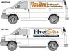
This customer has had the current (before) design on his vans and signage for years. I did not design this, but have been reproducing these crappy graphics every time he gets a new van. I have hinted at a redesign a few times and he has not been interested because we usually do not have time and he is always afraid it will cost him too much money.

This year he has come to me and said that he may be ready for a fresh look this time, but agrees with me that we must retain some continuity from his other vans and signage. So the redesign must still hint at the previous style and have a similar look/feel to keep it recognizable and also not require him to go and re-letter his other vans.

I am kind of liking the new design I have so far, but I think that he will want to keep the stars in there somehow, but I am not feeling it no matter what I try. Anyone have a suggestion on what direction to go with this?

Any and all critique is welcome. There will be some additional lettering going on the van as well (phone number, web address, etc) but want to just focus on the name for now.

Thanks!
 

Attachments

  • signs101.jpg
    signs101.jpg
    76.3 KB · Views: 131

Doyle

New Member
I was thinking of actually incorporating 5 stars, otherwise it would seem to only be 1 star right? Thanks for the suggestion though
 

Gino

Premium Subscriber
In all honesty, that doesn’t remind me of a ‘New Look’. You just added a color, changed a font and repositioned some words. That would be a change, but not a ‘New Look’. Try thinking about using more of the truck or perhaps think about running words on a slant from bottom to top or introducing a graphic of some sort.

Also, there doesn’t seem to be any contact information, identification or secondary copy. Does the guy want such a sterile look ??
 

Mikeifg

New Member
Might be ugly but what about 5 stars arced over your layout. Which looks really good by the way.
 

GoodPeopleFlags

New Member
I'm not a fan of the reverse with lower case letters. The descending letters make it look weird. I would also move it down below the window and maybe stretch it across the side. (The block of the reverse - not stretch the lettering.)
 

Sticky Signs

New Member
I like the new design although the blue box looks like it should be bigger. I also agree with placing the stars on an arc above the logo.
 

Steve C.

New Member
Just a reminder that you have a swash 'r' in A&S Speedway Script... its the <
 

Attachments

  • fivestar.jpg
    fivestar.jpg
    82.1 KB · Views: 100

Jillbeans

New Member
I like what you did, and I like what Steve did with it.
But even tho it's 5 stars I would just use one orange one for the "i" dot.
It's much more concise than the original.
Love....Jill
 

rjpjr

New Member
maybe put the stars back underneath the name like it was originally...
 

Attachments

  • Five-Star.jpg
    Five-Star.jpg
    82.3 KB · Views: 86

SignManiac

New Member
I think you should put six stars in the logo and see if anyone catches it? A great way to find out if clients are really taking notice of his logo.
 

Pat Whatley

New Member
I like the new design but I see a big flaw with the van layout. That reversed out panel is going to be a pain to install with the "window" indentions. I'd move it down on to the flat panel.
 

Doyle

New Member
Thank you all! Great suggestions! And Steve, I did that EXACT same thing in one of my proofs, but for some reason I wasn't feeling it. I sent a proof to the customer already with just one star as the dot in the "i", I was thinking the same thing Jill.

Let me know what you think of the attached layout, as it is not final.
 

Attachments

  • signs101.jpg
    signs101.jpg
    81.3 KB · Views: 83

Doyle

New Member
Ignore the drop shadow on the one side of the van, I decided to get rid of it.... but forgot to remove it on this image.
 
Top