-
I want to thank all the members that have upgraded your accounts. I truly appreciate your support of the site monetarily. Supporting the site keeps this site up and running as a lot of work daily goes on behind the scenes. Click to Support Signs101 ...
You are using an out of date browser. It may not display this or other websites correctly.
You should upgrade or use an alternative browser.
You should upgrade or use an alternative browser.
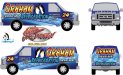
Van Skin Design
- Thread starter formanek
- Start date
Pat Whatley
New Member
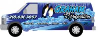
My first impression was that it was for a comic book shop, video arcade, or amusement park. Don't ask me to explain that, that's just what I thought.
Jillbeans
New Member
Looks like you have got a bit of font squishing and stretching going on there, which is never a good idea.
I like the penguins.
(hey I'm from Pittsburgh)
but you have too many casual fonts (can't tell if it's the same one but stretched) going on.
Try the phone # and refrigeration in something like Impact, and Graham in caps and lower case if that is an option.
Your lettering is way too big on the sides, too.
Leave some breathing room.
You're terrifying those poor birds.
Why is refrigeration so low on the bottom of the van back?
Is it melting?
Love....Jill
Looks like you have got a bit of font squishing and stretching going on there, which is never a good idea.
I like the penguins.
(hey I'm from Pittsburgh)
but you have too many casual fonts (can't tell if it's the same one but stretched) going on.
Try the phone # and refrigeration in something like Impact, and Graham in caps and lower case if that is an option.
Your lettering is way too big on the sides, too.
Leave some breathing room.
You're terrifying those poor birds.
Why is refrigeration so low on the bottom of the van back?
Is it melting?
Love....Jill
Thanks for the constructive ideas. The customer is concerned about people not seeing it. I am making some changes to the fonts and working on the kerning a bit. Never should I "give up" and post at after midnight my time period.

The penguins HAVE to be in the design. It is their trademark. Jilly I agree now that I look again this AM about the room to breathe.
The refrigeration on the back of the van went low because of the damn license plate area. I am now trying to shrink the lettering and place in a new area.
Again, thanks for the constructive criticism. Gotta love the "don't ask me why comments."

Craig Sjoquist
New Member
I'll wait till you make changes. since I know you can make it look better.
I hesitate posting unfinished designs but....
Each side has subtle changes like the icicles hanging from the top of the side on one and not on the other.
Be nice to me... I am sensitive.
Version #2
Attachments
signcrafters london
New Member
Are you married to the Graham font? Too casual for main copy in this case, IMO. I like the graphics, though.
laserman70
New Member
I like version 2 better. Put the # under the Commercial - inst.
The # just look s out of place to me.
The # just look s out of place to me.
Gino
Premium Subscriber
For starters.... the ice doesn't look right being so blueish.
Why must all the copy be italicized ??
In a monochrome scale, you have just about everything around 4 to 6. Turn this into a grey-scale and you'll see what I mean.
Are you not doing anything to the roof ?? Reason being.... the icicles will be appearing from nowhere in the real-world.
Why must all the copy be italicized ??
In a monochrome scale, you have just about everything around 4 to 6. Turn this into a grey-scale and you'll see what I mean.
Are you not doing anything to the roof ?? Reason being.... the icicles will be appearing from nowhere in the real-world.
Are you married to the Graham font? Too casual for main copy in this case, IMO. I like the graphics, though.
Not married to anything except my wife.
") Customer is not letting me use much for color and I am trying to get other opinions so I can start using it. He also wants me to use the snow covered font (almonte snow?) but ever damn truck I see with refrigeration uses it. It is hard to read in my opinion.
Customer is not letting me use much for color and I am trying to get other opinions so I can start using it. He also wants me to use the snow covered font (almonte snow?) but ever damn truck I see with refrigeration uses it. It is hard to read in my opinion.For starters.... the ice doesn't look right being so blueish.
Why must all the copy be italicized ??
In a monochrome scale, you have just about everything around 4 to 6. Turn this into a grey-scale and you'll see what I mean.
Are you not doing anything to the roof ?? Reason being.... the icicles will be appearing from nowhere in the real-world.
No roof, but the blue will go up to the point of the cap ridge. Ice will be coming from the drip edge on the roof where the side panels and roof meet.
Gino
Premium Subscriber
Here's what I mean by real life circumstances.........
Once a design is off the screen and in a real environment..... you can't fool the eye into seeing things that are just really there. To me, this looks odd, therefore not finished. Only food for thought. It's your project.

Here's what I mean by real life circumstances.........Once a design is off the screen and in a real environment..... you can't fool the eye into seeing things that are just really there. To me, this looks odd, therefore not finished. Only food for thought. It's your project.
I know what you meant and I am working to show the customer that too. This picture will help. Thanks. I am trying to talk them into skin'n the roof blue as well. Thanks Gino.

HulkSmash
New Member
I am trying to talk them into skin'n the roof blue as well. Thanks Gino.
^^^^^^^ Why would you EVER do that.
^^^^^^^ Why would you EVER do that.
So leave it white Colorado? You ask a lot of questions but never seem to be too informative.:Sleeping: