• I want to thank all the members that have upgraded your accounts. I truly appreciate your support of the site monetarily. Supporting the site keeps this site up and running as a lot of work daily goes on behind the scenes. Click to Support Signs101 ...

website concept

Speedsterbeast

New Member
The photos are so vibrant and large, I would extend the delay between changes another 2 seconds so you can really take in the picture.
I find this to be the norm on most websites, so maybe it'e just me.
 

ucmj22

New Member
I know its easier to do this in photoshop than dreamweaver, but here is a quick one
 

Attachments

  • Untitled-2.jpg
    Untitled-2.jpg
    284.1 KB · Views: 122

qmr55

New Member
Try something like this for the boxes, then follow the same concept for the rest of the site. Make it all uniform. White background.
 

Attachments

  • boxes2.jpg
    boxes2.jpg
    34.9 KB · Views: 135

Sticky Signs

New Member
I'm liking this much better than the first version. I really like the image of the earth on the guys face. Not so sure about the guy in the leotard though. LOL
One thing that's bothering me is the contours of your rounded corners don't match.
 

grafixemporium

New Member
Proofread before you publish.

You are offering design services. Proofreading is a HUGE part of our jobs. If you are willing to represent your own company with mistakes in your work... well, your clients aren't going to feel too confident in your abilities.

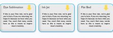
Anyone spot the spelling mistake?

As far as layout goes... the rotating image is way too big. It consumes more than the entire home page. Consider a cleaner, more consise approach and cut that image box to about 1/3 of what it is now. Also, the wipe on the pictures looks cheesy.

Your home page has no real "call to action". You get there, look at the pretty, gigantic pictures... then what? Point your potential clients in the right direction. Give them something to click for. Also consider giving them something to come back another day for. Even static websites that are more of a portfolio than anything else, can have some dynamic content that keep people coming back again and again.
 

Pat Whatley

New Member
The face with the earth image on it scared the shit out of a three year old.

Just throwing that out there.

(not my three year olds, mine aren't scared of anything except Mommy)
 

charissabuskirk

New Member
Text and such are just placeholders for now.

It's amazing what a simple drop shadow will do to add a little dimension... if you don't want the "drop shadows and bubbled icons/panels" maybe try making them look like 3D boxes?

Take a look at the website Circleville posted... a slight gradient to corner background and the striped texture is used as an accent. I think the reason it doesn't work for you is that it's just too much. Maybe use it in the outer boxes on the bottom elements?
 
Top