• I want to thank all the members that have upgraded your accounts. I truly appreciate your support of the site monetarily. Supporting the site keeps this site up and running as a lot of work daily goes on behind the scenes. Click to Support Signs101 ...

Wrap Design Help/Critique

acothran

New Member
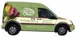
I would like your input on a wrap design I'm working on. Here's an overview.

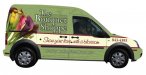
Client: Local florist been in business since '72. No logo but has the tag line: "Show your love with a blossom" on his ads (yellow pages, etc)
Vehicle: Brand new Ford Transit Connect
Artwork: For flowers, client wants Calla Lillies. He browsed iStock and liked the wreath looking vector on the door w/ the name of the shop. He also likes the vine look so I incorporated that into the background.
Colors: My color ideas came from the bouquet, client didn't have a preference.

This is the first draft, or the first design idea tweaked to where I don't hate it. Please overlook the watermark on the bouquet of flowers, I'm using the comp until I am for sure I'll use that graphic. I appreciate any input.

Allen
 

Attachments

  • TBS Wrap.jpg
    TBS Wrap.jpg
    38.6 KB · Views: 118

signmeup

New Member
I'd make the text for "The Bouquet Shoppe" Huge and move the tag line down to replace the "72" tagline. Too many tag lines as is. The logo on the door is redundant.
 

Dan Antonelli

New Member
swap the location of the logo on door and tagline, then delete logo over the flowers. Logo should be much bigger. Run you tagline on the doors. Be careful of distance legibility of the logo; medium to light green BG will require a heavier DK green outline on the logo.

If you're going to use a bouquet I'd like to see one with more color.
 
First impression is that "The Bouquet Shoppe" gets lost in in the flowers on the rear panel. The lettering on the driver/passenger door doesn't flow very nicely with the shape of the wreath, too much negative space in the front and none in the rear of the lettering.

Visually my eye goes straight to the phone number, it seems to somehow to dominate the design.

I like the subtle flourishes in the background but they may be too subtle.

~Chris
 

Craig Sjoquist

New Member
I like it ... But thinks you can improve it greatly

What I like best
the white bar with strong ..Phone leading to name or from other side ... not big on strong area codes
the flower ..... but thinks you can super size it
the tag line and script used
the bottom tag and placement

keep at it you got something
 

acothran

New Member
Thank you all for your suggestions. Here are some of the revisions you all recommended. I changed the bouquet to one with more colors. I also think the "lean" of the bouquet helps draw the eye to the "logo" (I use that term loosely) which I moved to the back door window. Do you think it will be a problem if the shop name/logo is on window perf? As Dan mentioned, I was concerned about the contrast of the shop name so I took the easy out and filled in that area, so I'm not sure if that is the answer. I also moved the tag line to the front door.

I appreciate all of your input. Thanks again.

Allen
 

Attachments

  • TBS Wrap 2.jpg
    TBS Wrap 2.jpg
    40.2 KB · Views: 67

acothran

New Member
I would like to make the logo larger too but I'm not sure how to do that and keep it within the parameters of the vehicle layout. I can put it on the back area but that seem to be the best place to put the bouquet. I don't want to run the logo over door creases and make it look disjointed. I hate seeing wraps that look like the designer took no consideration as to the lines of the vehicle.

I'll mess around some more. I appreciate the feedback.

Allen
 

acothran

New Member
Another revision

If you are following the progress, here is #3.

I changed or attempted to:
- Make the logo bigger
- Add something to the front fender to balance out the design. You can't tell from this view but the plan is for the bouquet on the fender extend to the hood to help connect the hood with the sides.
- Changed the color of the line between the green and white to more orange than maroon. It matches better if I go with the fender flowers.


My concerns:
- In making the logo bigger, the wreath of flowers now overlap the big bouquet. I've tried about 50 different placements on the big bouquet and nothing looked better.
- The fender flowers help balance the "back heavy" graphics but kind of look like they were just thrown on.
- I still wish "Serving Bowling Green Since 1972" was bigger but I'm concerned about the concave channels making bigger text look strange.

As always, I appreciate your input.

Allen
 

Attachments

  • TBS Wrap 3.jpg
    TBS Wrap 3.jpg
    40.8 KB · Views: 71

signmeup

New Member
I think the flowers on the front are distracting.
The tag line seems really odd to me. "Show your love with a blossom"....just one flower? How about a whole bunch of flowers? Like...I don't know... a bouquet? From the Bouquet Shoppe.
 

Attachments

  • BouquetShoppeSm.jpg
    BouquetShoppeSm.jpg
    37.2 KB · Views: 73
Last edited:

Malkin

New Member
Maybe swap the logo and the bouquet. Make logo fill the rear area and adjust colors & size for best legibility. Then flip the bouquet so that it faces the logo (toward the rear) and is coming out of the B pillar (behind the door).


just a thought

Edit: oooh... signmeup's is good!
 

Craig Sjoquist

New Member
both the 2nd & 3rd version look good a bit busy but needed also ...front flowers nope ...maybe on hood they look good

Phone ... the area code is way to strong or bold up the 7 numbers

tag line .... to correct... raise it up a bit so good space on bottom is more then top
...Tag line ..I liked next to the flowers ..looked elegant also the selling point.. name of shop is secondary info

I did like post #10 signmeup.. because your eye started at flower and moved down to tag line then phone but it was way to small and low ...simple works well though
 

acothran

New Member
And again.....

Thanks for all the input and Signmeup, thanks for your version. I took away the flower wreath on the shop name. The customer likes that but I think I might put it on the hood and back window if he insists. I have to keep the "Serving BG.....1972" on there as well, although it doesn't have to be as prominent. I think this version is what I'll submit to the client.

Thanks,
Allen
 

Attachments

  • TBC Proof 1.jpg
    TBC Proof 1.jpg
    42.9 KB · Views: 86

signmeup

New Member
I think you had nicer flowers in the first post. The phone number looks a bit orphaned up on the fender. How about like this?
 

Attachments

  • BouquetShoppe2sm.jpg
    BouquetShoppe2sm.jpg
    38.5 KB · Views: 66

acothran

New Member
I think you had nicer flowers in the first post. The phone number looks a bit orphaned up on the fender. How about like this?

I liked the flowers in the first post as well but the second bouquet has more color and in my planning meeting with the client, he mentioned different color flowers.

I also think the phone number looks a bit orphaned on the fender but I'm concerned about placing it on the bottom side, with the factory indentions/ridges. I don't want the phone number to look distorted at all.

Allen
 

signmeup

New Member
Don't you just love all the ridges and creases the manufacturers add to their work vehicles. Makes you wonder what the heck they are thinking. Maybe they don't realize that some of these vehicles will get lettering put on them. :rolleyes:
 
Top