-
I want to thank all the members that have upgraded your accounts. I truly appreciate your support of the site monetarily. Supporting the site keeps this site up and running as a lot of work daily goes on behind the scenes. Click to Support Signs101 ...
Search results
-

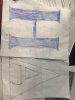
Another MonuMental Logo fail
It looks like all the distorted photos people send me of their art where the sides are not parallel, caused by taking a picture at an angle- The Vector Doctor
- Post #4
- Forum: Logo Design
-
-
Re-creating Logos
Oddly enough, I find myself doing it all day long. Vectorizing that is- The Vector Doctor
- Post #16
- Forum: Logo Design
-
Intro to Signs 101
Hello from Central Ohio- The Vector Doctor
- Post #7
- Forum: New Member Introductions
-
Getting My First SmartPhone
I am an exclusive Apple user. Though I still use an iphone 4s. Never used a case, full glass back and front and have NEVER dropped it or shattered it. I guess I am lucky and super careful Still using ios7. There is no feature of ios8 or 9 that I cannot live without I am holding on to this...- The Vector Doctor
- Post #22
- Forum: Miscellaneous Hardware
-

-

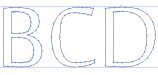
Am I the only one?
If you use Illustrator there is a function in the spacing with options for optical and auto. The bottom sample here shows optical which is a bit better and tightens up the extra spacing that always shows up around the number 1 You still have to tweak sometimes but it helps if you are not too picky- The Vector Doctor
- Post #12
- Forum: Fonts and Typography
-

Font id help please
Most likely custom. It appears that this started out as Eurostile Bold and was customized- The Vector Doctor
- Post #2
- Forum: Fonts and Typography
-

it's not candara font
try engravers gothic or blair- The Vector Doctor
- Post #3
- Forum: Fonts and Typography
-

Can`t find anything
Since none of the letters are duplicates this is either a font with a very extended set of alternates or custom. My guess is custom- The Vector Doctor
- Post #2
- Forum: Fonts and Typography
-

starting out
Note to self: Get Rick fired up a bit and maybe I can get him to design me some cool logos for free- The Vector Doctor
- Post #41
- Forum: Designs & Layouts
-
starting out
Agree with Fenris... this is a step backwards- The Vector Doctor
- Post #9
- Forum: Designs & Layouts
-
Hello from South of France
Bonjour, from Ohio USA- The Vector Doctor
- Post #8
- Forum: New Member Introductions
-
Hello from Oregon
Welcome from the Buckeye state!- The Vector Doctor
- Post #11
- Forum: New Member Introductions
-
Creating a vector contour for a photo
https://www.dropbox.com/s/ksnzpbtot9yner5/cut%20contour%20vector.mov?dl=0- The Vector Doctor
- Post #10
- Forum: Videos
-

Please help identify this font
Top line is Century Gothic Bold and then an outline or stroke was added to make it even bolder- The Vector Doctor
- Post #9
- Forum: Fonts and Typography
-

Please help identify
It appears to be a Franklin Gothic Demi or Bold- The Vector Doctor
- Post #4
- Forum: Fonts and Typography
-
Font Question: Copperplate vs. Copperplate Gothic
On close inspection there are differences between copperplates. Even the same name from different font companies. Adobe's copperplate is different than copperplate from other font companies Serifs are inconsitent. O's and C's are more oval in one versus the other- The Vector Doctor
- Post #3
- Forum: Fonts and Typography
-
Shout Out For "The Vector Doctor"
Thanks Signworks for the shout out. And to all the others who backed him up. I appreciate the love.- The Vector Doctor
- Post #7
- Forum: Vendor Shout Out
-
Font help - Traced from routed acrylic letters
Penumbra flare is close too or could be manipulated to better match- The Vector Doctor
- Post #15
- Forum: Fonts and Typography
-
Good fonts with low anchors
Can you explain further?? A good letter O can be done with 8 anchors, 4 for the inside and 4 for the outside circle/oval. I always trace letters and shapes with as few anchors as possible for smooth curves- The Vector Doctor
- Post #8
- Forum: Fonts and Typography