-
I want to thank all the members that have upgraded your accounts. I truly appreciate your support of the site monetarily. Supporting the site keeps this site up and running as a lot of work daily goes on behind the scenes. Click to Support Signs101 ...
Search results
-

-
-
YouTube
If you're willing, I could use some more subscribers to help my video rankings/search engine results: Precision Sign Services YouTube channel I'd be happy to return the favor. Thanks!- Moze
- Thread
- Replies: 8
- Forum: General Chit-Chat
-
Post Most Educational Youtube channel you enjoy learning from.
I like this one. :) The videos I wind up watching the most of are vinyl installation techniques, videos on adhesives, anchors, etc. The ones I watch the most though are on tools. There's nothing like having the perfect tool to complete a job.- Moze
- Post #4
- Forum: General Chit-Chat
-
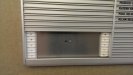
Can You Identify This Directory Type?
Looks like/similar to Slatz, but Slatz uses black clips. Not sure who makes that one.- Moze
- Post #2
- Forum: Product and Supplier Referrals
-
Can I laminate Stainless Steel to PVC?
I think you'd be fine as long as you used VHB tape. The tape allows for the different expansion rates.- Moze
- Post #2
- Forum: Dimensional Signs
-
Are there any members here in the Kansas City area?
I potentially have to transport a large SF illuminated wall-mount cabinet from KS to TX. Would need assistance loading. Anyone in the area that might be interested? If so, please PM or email me. Thank you.- Moze
- Thread
- Replies: 1
- Forum: General Chit-Chat
-
ACM Panel on Brick....
I assume it's the same/similar makeup as Loctite Power Grab. There are a number of companies doing that same demo with the same looking stuff. As far as the OP's question, explain both options to the customer. If the customer wants you to stand behind your work, you're going to use lot's of...- Moze
- Post #12
- Forum: Installation Equipment & Techniques
-

What would you guys add (or remove) from this wrap install kit?
Huh? I didn't say anything lol... But I do appreciate this thread. Just reading up on some of the tools being used, so thanks for everyone's contributions.- Moze
- Post #35
- Forum: Vehicle Wraps
-
Hanging gatorfoam panels on wall - how?
Yes sir. These were all done with Command Strips. The only thing you need to be mindful of is if there are any irregularities in the drywall. If it's too wavy, it will cause issues, whether you use Command Strips or VHB tape. Gatorfoam is rigid enough, that over time, it will pop either of those...- Moze
- Post #10
- Forum: Installation Equipment & Techniques
-
Hanging gatorfoam panels on wall - how?
Command Strips- Moze
- Post #4
- Forum: Installation Equipment & Techniques
-
Pizza shop makeover
The more important question is, are their wings any good?- Moze
- Post #4
- Forum: Portfolio Board
-
ADA Suite Signs And Directories
http://www.adalenses.com Bryan Kay - does great work.- Moze
- Post #3
- Forum: Product and Supplier Referrals
-
Can I get some input on this please?
Makes perfect sense. Thanks again for all of the responses!- Moze
- Post #12
- Forum: Fonts and Typography
-
Can I get some input on this please?
Thank you for all of the responses. My assumption was that when the wording was laid out in whatever program, you just typed out what you wanted and they were automatically spaced. Is that not how it works?- Moze
- Post #7
- Forum: Fonts and Typography
-
Can I get some input on this please?
I assume you meant the 'R' and 'E'...? Anyway, I get what you're saying. And I agree, it looks like the 'E' and 'A' should be closer. That looks more accurate to me.- Moze
- Post #4
- Forum: Fonts and Typography
-
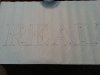
Can I get some input on this please?
I'm not a font expert (obviously), but I know spacing between letters isn't always exactly the same from letter to letter. The attached photos show the bottom serifs of the 'R' and the 'E' closer together than the 'A' and the 'L'. Is this an error or is that just how this font is supposed to be?- Moze
- Thread
- Replies: 12
- Forum: Fonts and Typography
-
Longer cabinet face joining
Keep in mind too, the bigger face is going to be in the 70-100 pound range depending on the thickness of the material.- Moze
- Post #8
- Forum: General Signmaking Topics
-
Genie or JLG Aerial Lifts for Installation? USA or Canada
This is one of the ones I use: http://www.haulotte-usa.com/index.aspx?site=US&lang=EN&page=MAC§ion=PRODUIT&objet=MACHINE%204527A&motorisation=electrique 45' platform height, 51' working height.- Moze
- Post #13
- Forum: Installation Equipment & Techniques
-

-
Genie or JLG Aerial Lifts for Installation? USA or Canada
I get the Bil-Jax for $100 less than the JLG and it's a better lift. If you're near a Taylor Rental (or someone else that might rent them) you might want to take a look.- Moze
- Post #10
- Forum: Installation Equipment & Techniques