-
I want to thank all the members that have upgraded your accounts. I truly appreciate your support of the site monetarily. Supporting the site keeps this site up and running as a lot of work daily goes on behind the scenes. Click to Support Signs101 ...
Search results
-

Adobe's new pricing strategy
Do tell us...where did you get it? JB- James Burke
- Post #45
- Forum: Adobe
-
-
First "real" banner
The letterstyle is Optima. I'm more of a traditionalist, and I have a great appreciation for the timeless features of Roman typefaces. I'm also a big fan of Frank Lloyd Wright's Prarie School of design...low and wide, with great emphasis on the horizontal...read about it here...- James Burke
- Post #33
- Forum: General Chit-Chat
-
First "real" banner
I did a quick layout this way and while it's a little more aesthetically pleasing to read from top to bottom, it creates a conflict with eyeballs as they work their way down through the stones...they try to focus on the visual impact of the stones while trying to read the text at the same time...- James Burke
- Post #30
- Forum: General Chit-Chat
-
First "real" banner
That'd make sense...just like the spine of a book. JB- James Burke
- Post #28
- Forum: General Chit-Chat
-
Interesting Read
Still looking for that elusive "LIKE" button. JB- James Burke
- Post #2
- Forum: General Chit-Chat
-

-
First "real" banner
Ok...so it doesn't appear to pop in a low-res web photo, but it looks totally different in a PS file that fills the width of a 22 inch monitor. Believe me, the drop shadow has substantial depth and contrast. I'll take a look at the possibility of doing a reversed panel in the a.m. with...- James Burke
- Post #24
- Forum: General Chit-Chat
-
First "real" banner
Ok...how about a drop shadow for the text...now it really pops. BTW...this is needed for next weekend, not this weekend as stated in my first post. Again, thanks for all the constructive criticism and assistance. After about 24 hours of playing, I am so addicted to Photoshop now. I...- James Burke
- Post #22
- Forum: General Chit-Chat
-
First "real" banner
I think that might fight with my floor display which is a weathered (distressed) gray cedar planking. JB- James Burke
- Post #21
- Forum: General Chit-Chat
-
First "real" banner
Whew...I'm lookin' to wrap this up...way too much time horsin' around, but I think it's about where I want it. Wow...looking back at my first post...it really looked plain and crappy. Thank you for all the input. JB- James Burke
- Post #19
- Forum: General Chit-Chat
-
First "real" banner
Yep...by the left side, I meant the stones as opposed to the text. I kinda like the zig zag effect. JB- James Burke
- Post #18
- Forum: General Chit-Chat
-
First "real" banner
Rock or rock...that's a given for most jobs. Gray isn't the only color as you can see. We also do fundraiser bricks, limestone address blocks and such. We've seen an unusual interest in the natural boulder headstones, though. JB- James Burke
- Post #16
- Forum: General Chit-Chat
-
First "real" banner
Here it is with a 50% gray background with a canvas texture. The texture most likely won't show up in this photo, though...but its there. I'm going to tweak the opacity a little bit because it still seems way too dark. JB- James Burke
- Post #15
- Forum: General Chit-Chat
-
First "real" banner
That was also another thought....I'll try to figure that out. As for the real stone....no-can-do! Thanks guys.- James Burke
- Post #12
- Forum: General Chit-Chat
-
First "real" banner
Here it is with the white outline around the text. It's definitely easier to read, for sure. Mainframe, thank's for pushing the issue. JB- James Burke
- Post #10
- Forum: General Chit-Chat
-
First "real" banner
I had thought of that earlier, but don't know how to do it PS. I'll try it in Illy and post it to see what you think. JB- James Burke
- Post #9
- Forum: General Chit-Chat
-
Scrubby Zoom
Does anybody know if Illustrator CS6 will feature the scrubby zoom that is presently available with Photoshop CS5? That's one sweet tool. Careful if you download the demo to try it....you'll end up wanting to upgrade. I most likely will. Update: Since the demo download is CS5...- James Burke
- Thread
- Replies: 3
- Forum: Adobe
-
First "real" banner
Here's the same photo with a black border around it to set it off from the web page background. Border will not appear on the banner. Again, my intention is to lead the viewer's eye from top to bottom, and then back up again as they read the text...and then back down through the stones in...- James Burke
- Post #6
- Forum: General Chit-Chat
-
First "real" banner
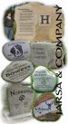
There will be stones on the floor display and would obscure text along the bottom. And I figured if I placed it across the top, it would only garner a quick glance. So I went out on a limb and placed along the side in hopes that it would warrant a second look as the viewer's eye is lead...- James Burke
- Post #5
- Forum: General Chit-Chat
-
First "real" banner
Stone is all I do. That's why I tend to be a little handicapped when it comes to general sign layout and color theory. JB- James Burke
- Post #3
- Forum: General Chit-Chat