-
I want to thank all the members that have upgraded your accounts. I truly appreciate your support of the site monetarily. Supporting the site keeps this site up and running as a lot of work daily goes on behind the scenes. Click to Support Signs101 ...
Search results
-
Another Font Request
You might be able to fake it with the font from the Spiderman movies and the Playstation 3 logo. I see it circulated under the name "Homoarakhan," but I'm not sure that's accurate.- WI
- Post #6
- Forum: Fonts and Typography
-
-
Automation in Photoshop - PDF to JPG
Check out the Actions palette in Photoshop. Record what you want to do on one of the .PDFs and then batch-process the rest of the folder. -
Photo Poster Paper?
We use Solvex 220g Gloss Finish photo paper for this one client. I run the files on a Mimaki JV33 set up to CMYKcm on a sixteen pass stock profile, and they come out looking really good on this material. This actually surprises me, because every time I've used Solvex vinyl for anything it was... -
Advice on LEJ-640 Flatbed
First things first: It will NOT print a full 4x8 panel without some serious tinkering. We've gotten close to a full 96" run with a sled on the front and the back, but without that kind of serious fiddling, you're going to have to settle for 46" by 92". Max. This printer is HUGE. I mean... -
Shop organization examples
The article linked in the OP had some great ideas. However, don't store rigid material vertically like that if you've got a flatbed UV or any other piece of equipment that prints directly to the surface of a board. Sitting on an edge like that can cause a panel to warp really badly, and feeding...- WI
- Post #28
- Forum: Tips & Tricks
-
Graphtec Plotter Issue
I've got an FC series Graphtec. I use Cutting Master 2 to run the machine from Illustrator. A lot of what we do with this thing is cutting out large numbers of individual decals, for which we use the Graphtec's XxY repeat feature. This morning, the thing has started to cut jobs in columns... -

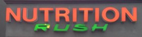
Font ID
Bottom font is definitely Myriad (Reg. or Roman, take your pick)- WI
- Post #5
- Forum: Fonts and Typography
-

Logo critique
Hang on to the dogs, you might be able to use them for t-shirts or something like that down the road. Remember, less is more. Glad I could help. ;)- WI
- Post #17
- Forum: Logo Design
-
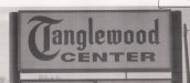
Font Id Please
In general, that's a riff on a blackletter typeface (of which there are literally thousands). Is that a hand-painted sign? If it is, you might be up the creek as far as finding a perfect match, but this might help you nail it down to a family or style...- WI
- Post #4
- Forum: Fonts and Typography
-
wrap design feedback
This look can be pulled off, but it's hard, and you have not accomplished it here. First of all, your background and your foreground -cannot- swap colors. Right now you've got white letters and white elements in the background, and because of that even letters with heavy black outlines get...- WI
- Post #6
- Forum: Vehicle Wraps
-
Logo critique
You might be on to something if you got rid of the dogs and just tucked "& Kitty" right under "Three Dogs." As it stands you're gonna flub the postage-stamp test pretty badly.- WI
- Post #5
- Forum: Logo Design
-

Font Help Please
Per Weiss's tip, check this out; http://www.identifont.com/similar?606 All of the glyphs have punch-outs, but the silhouette is the same as your sample.- WI
- Post #10
- Forum: Fonts and Typography
-
Font Help Please
Looks like someone beat Elephant with a bag of hot nickles. Where is that from?- WI
- Post #3
- Forum: Fonts and Typography
-

flower logo
Right off the top of my head I want the effects to match on all the lettering. In the stacked version the depth and thickness of the drop shadow is much larger on "Flower" than it is on "Gallery." You might also want to work on the flower design a little more, it looks a little rushed next to...- WI
- Post #6
- Forum: Logo Design
-

Font Help Please
That bears a passing resemblance to Optima, too. If your client isn't a crazy detail nut you could probably get away with it.- WI
- Post #4
- Forum: Fonts and Typography
-

Font help please
"Bulldogs" is Runic MT, AKA the Final Fantasy font. "Michigan" might be a wide version of Yearbook or College / Collegiate if you can find such a thing.- WI
- Post #3
- Forum: Fonts and Typography
-
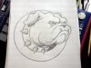
Bulldog
Your bulldog is tight, looks really good. When you construct the logo with the head poking through the "O", however, he totally gets lost. I'd ditch that concept. The fonts you're using for "Absolute" and "Sound and Security" are really fighting for attention. I'd step down "Sound and...- WI
- Post #18
- Forum: Logo Design
-
Graphtec registration marks
Did you try going over the reg marks with a sharpie? Pretty serious kludge, but it works.- WI
- Post #2
- Forum: Tips & Tricks
-
Mimaki JV33 smudging/streaking
Looks like that might be a material issue. Did you recently change the plastic you're printing on? If you're using the same heat settings and new decal, that might cause it to buckle under the printhead. Also, depending on how it's stored you might have some kind of ovaling or flattening of the... -

how is this done?
If you needed to cut this out of vinyl (for example) could you just expand the effect to get vectors out of this? I ask because few years back I found out the hard way that I had a RIP that didn't understand proprietary Illustrator styles very well. I've been kind of gun-shy about them ever...- WI
- Post #23
- Forum: Tips & Tricks