-
I want to thank all the members that have upgraded your accounts. I truly appreciate your support of the site monetarily. Supporting the site keeps this site up and running as a lot of work daily goes on behind the scenes. Click to Support Signs101 ...
Search results
-

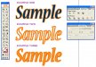
arrgh! font madness
If it's something that you can massage a bit, try Aurora Bold Condensed. It'll be off, but it displays some similar characteristics. oooookay, maybe not the "S" so much, but it does have some other distinctive characters. vid- vid
- Post #4
- Forum: Fonts and Typography
-
-
AI-CS2: Tip on using outline strokes
ooooooohhhhhh yeah, Derf, you know Modesto. But ya gotta give the place a break. I'm not sure which travel magazine picked it, but we're proud to be listed as having one of the most spectacular sights of all of California right here on the edge of town --- it's "The Welcome to Modesto" sign in... -
AI-CS2: Tip on using outline strokes
I have to admit, that comment made me all huffy. I was already to extend an invitation to meet Derf behind the woodshed to continue this discussion... But there is some validity in that view point. Yes, signmakers need to be competent with their software. Certainly there are varied levels of... -
AI-CS2: Tip on using outline strokes
Admittedly, I haven't had the time to play out too many of the scenarios, but now I'm questioning if it is Importing/Placing the non-Adobe graphic... or is it opening the CDR or EPS graphic in Illustrator that is the issue? Whatever it is, it essentially changes the setting from the default... -
AI-CS2: Tip on using outline strokes
Eyehawk: While, I don't mean to defame your status as a signmaker, if you are creating all original art in Illustrator... on a Mac... and don't handle customer files, you probably aren't going to see the phenomenon Bobby H described. Software has come a long way since '89. There are things... -
AI-CS2: Tip on using outline strokes
oooooooooooooooooooooooooooooooooooooooo good one! I really like that tip! Bobby H: Like Eyehawk, my proficiency is Mac based, so it took me a couple times reading your post to understand what you were talking about... (ummmmm, this isn't to say that being a Mac guy implies that I'm a little... -

Cast Your Vote - Dreem Time Contest
Very nice, very nice!. There’s some great layouts and great concepts here. I liked Dale Horn #3 because it reminded me of the “all seeing eye” --- like the eye on the back of a dollar bill... I liked Marlene Young and Shovelhead because of the personality concepts... I liked the color... -
Illustrator Selected Vector Colors
I love that feature. As you've determined, it is a function of the layers pallet. I reference the different colored lines to identify which layer a piece of art work is on. It's particularly helpful when building complex graphics that stack a number of different elements across multiple... -
Quark
I may be too late for this one, but type can be coverted to outlines/curves in Quark (MAC version 5). >Highlight the type with the type tool. >Select STYLE from the menu bar >Select TEXT TO BOX from the pull down menu A vector image of the type will be duplicated and offset below the...- vid
- Post #11
- Forum: General Software
-
Comment by 'vid' in media 'Rich's Elk'
Thanks for your comments. It was one of those torturous/fun projects. I shot the whole thing with a Paasche VL airbrush using a photo of the elk for reference. It even surprised me how nice it came out :)- vid
- Gallery comment
-
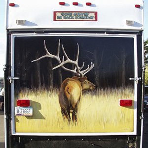
Rich's Elk
Airbrush painting on travel trailer. This was my first attempt at airbrushing on such a large scale with automotive paints. I used House of Kolor paint to pull this one off. It was a learning experience to say the least. I hadn't used an airbrush for years and haven't since... I was...- vid
- Media item
- airbrush elk rich\'s
- Comments: 5
- Category: Member Signs
-

nando's logo
This is the final version of the logo I did for a Mexican Cafe. After the initial type layout, the owner wanted to add a caricature of the chef, Nando. I drew this up and added the colors to the type to match the color swatches chosen for the restaurant dcor. Nando has been printed on menus...- vid
- Media item
- logo nando\'s
- Comments: 5
- Category: Adobe Illustrator
-

nando's Sign
This is the final logo type version for nando's Mexican Cafe. The restaurant was under construction when I met the owner quite by accident. He was in the process of getting his signs designed when I spoiled everything. We rushed to get this layout into production before a decision had been made...- vid
- Media item
- nando\'s sign
- Comments: 0
- Category: Adobe Illustrator
-
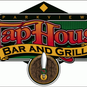
Tap House
Layout for a buiding sign. The final sign was built as a cabinet with pan channel letters for the "TapHouse" and the banner readign "Bar and Grill" extruding from the cabinet. An old half whiskey barrel, like those commonly found a landscape shops, was mounted on the sign and...- vid
- Media item
- dfiner house tap
- Comments: 3
- Category: Adobe Illustrator
-
From out of the Shadows
Hi Fred It's a brave new world for me. I'm looking at going from a Mac/Illustrator environment to a PC/CorelDraw environment. Certainly there will be some challenges to confront that I'll need some guidance on. --- Much like my recent move from Arizona to California... everything is just...- vid
- Post #3
- Forum: New Member Introductions
-
From out of the Shadows
Hello all - I figured I might as well introduce myself. I one of those guys that pops in once in a while reads a few posts and darts out. I do freelance graphics --- mostly for screen printed T-shirts. I have done art work for both commercial printing and sign applications, as well. With a...- vid
- Thread
- Replies: 4
- Forum: New Member Introductions