-
I want to thank all the members that have upgraded your accounts. I truly appreciate your support of the site monetarily. Supporting the site keeps this site up and running as a lot of work daily goes on behind the scenes. Click to Support Signs101 ...
Search results
-
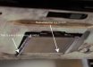
cutter fell off and got caught under head
It was a Mimaki JV33-160. I'm not positive what happened because I didn't see it happen. All I know is I heard a horrible sound, I went in to check the printer and the cutter has sitting in the area where the head sits when you turn off the printer, the blade looked like it tried to cut though... -
-

Logo critique
If your looking for a way to do a gradient that is a little different, you could try something like this.- Kyle Blue
- Post #14
- Forum: Logo Design
-

-
Newbie from the land down under
Hello and welcome from Minnesota.- Kyle Blue
- Post #20
- Forum: New Member Introductions
-

-
-
Greetings from the Arizona desert!
Welcome from Minnesota.- Kyle Blue
- Post #15
- Forum: New Member Introductions
-
-
-
cutter fell off and got caught under head
Thank you Jack. Please, let us honor the head with a moment of silence........... RIP -
increasing pixels??
Yes, you can double, triple even quadruple you pixels. But it will still be a 72ppi picture.- Kyle Blue
- Post #4
- Forum: Digital Printing
-

Pics from last weeks work
Nice. I like the Robinson Plumbing.- Kyle Blue
- Post #7
- Forum: Portfolio Board
-
cutter fell off and got caught under head
Oh it was ruined. This happened last week, we already had to replace the head. I've been busy and forgot to post this. I remembered this morning so I thought I'd throw it up on here as a warning to all. CHECK you cutter and make sure it's on tight... Otherwise this could happen to you... -
Translucent vinyl options?
Avery has a bunch of translucents in various colors. -
cutter fell off and got caught under head
"It's only a flesh wound!" (I wish) -
cutter fell off and got caught under head
Warning: this is not a pretty picture! -

New day, New ideas
I'd have to disagree with Jill (sorry Jill). The very meaning of a logo is a symbol or icon to represent your company. Some of the best logo's out there are just that. For example Target or Nike. Your logo will not match that kind of status or course, I'm just giving an example. There are...- Kyle Blue
- Post #7
- Forum: Logo Design
-
New day, New ideas
I like the second one down. The first one you lose the Mt. Vernon because its to small and away from the rest of the text. The third one down you lost me on the "S". It looks like it says pine. I like the last one, but I like the squares on the 2nd one. I like that ampersand. Maybe replace the...- Kyle Blue
- Post #2
- Forum: Logo Design
-
Photo Gallery
Looks good! I love the browns, gives it a good tone.- Kyle Blue
- Post #4
- Forum: Portfolio Board
-