-
I want to thank all the members that have upgraded your accounts. I truly appreciate your support of the site monetarily. Supporting the site keeps this site up and running as a lot of work daily goes on behind the scenes. Click to Support Signs101 ...
Search results
-

New Name and Logo I am considering..
I agree with you, But those names are taken with the .com I hear there are like 50 (Ray's Pizzas) in New York I just don't know the issues there could be having the same basic name as another even though they may do different type of work than I do. Stellar Designs does mainly t-Shirts and...- GRAFIKWORX
- Post #10
- Forum: Logo Design
-
-
New Name and Logo I am considering..
Ok so I will try the thinner outline on Stellar. It seems nobody likes the Star, Do you think the name Stellar evan needs a Star in the logo or not really? or is it just that its needs a much better Star? Also I have a few other concepts i'm working on, Ill post when they are ready...- GRAFIKWORX
- Post #8
- Forum: Logo Design
-

Changing our logo
- GRAFIKWORX
- Post #11
- Forum: Logo Design
-
New Name and Logo I am considering..
I am in the Custom Paint and Motor sports Design business for 12 years now. (I was in the sign business in the 90s) In this economy it is getting Herder and harder to maintain the 5000 sq.ft. shop, paint booth and employees to do this type of work. so now i'm looking into the near future of just...- GRAFIKWORX
- Thread
- Replies: 11
- Forum: Logo Design
-

Go ahead, tear it apart.
Looks Great for the Butcher shop. needs help to get the Liquor:bushmill: Store message across. the wording needs changing somehow..- GRAFIKWORX
- Post #5
- Forum: Logo Design
-
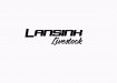
Stumped. Livestock Transport Logo
come to think about it, are you even in the sign business ?...- GRAFIKWORX
- Post #3
- Forum: Designs & Layouts
-
Stumped. Livestock Transport Logo
1. Fonts are hard to read. 2. Needs better spacing. 3. Doesn't look like a logo. with livestock in your name, you would expect to see some kind of artwork,? some simple Animal, that will draw more attention then just two words with crappy kerning. my opinion..- GRAFIKWORX
- Post #2
- Forum: Designs & Layouts
-

Too many "Designers"
how is #1 a logo and #2 is only a text layout.. the ribbons banners don't help much at all..- GRAFIKWORX
- Post #5
- Forum: Logo Design
-
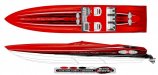
Boat Graphic Designs
Yes originally from a brush , but over the years I have tweaked and modified them several times to fit into other shapes and lengths.. we call them shreds...- GRAFIKWORX
- Post #30
- Forum: Designs & Layouts
-

what to do?
I would put the sub copy in the middle and the 24 hour / phone at the bottom , to create better negative space..- GRAFIKWORX
- Post #6
- Forum: Designs & Layouts
-
-

Boat Name
the transom is a shiny copper penny color. no gold leaf, Customer actually had the old gold leaf name removed. this is painted in base coat clear coat the letters were embossed with airbrush and drop shadowed. the whole transom was cleared over the name.- GRAFIKWORX
- Post #7
- Forum: Designs & Layouts
-
Boat Name
I was wondering what you think of these two name designs, which do you like better and why. the name has already been painted last week but im wondering did my customer picked the best one .. I know the best one is Really what the (customer liked). so not that it really matters now. I'm just...- GRAFIKWORX
- Thread
- Replies: 8
- Forum: Designs & Layouts
-
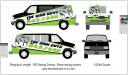
New Van Wrap
yes much better , looks good ,but it needs the (SG) logo like the other van has . to me that is what will help define the Brand, or consistency.- GRAFIKWORX
- Post #28
- Forum: Designs & Layouts
-
Boat Graphic Designs
Here are some more renderings I have done over the years..- GRAFIKWORX
- Post #27
- Forum: Designs & Layouts
-
New Van Wrap
I like your Other Van A LOT BETTER.... this one looks weak in the middle with the black top and green bottom. maybe put the black in the middle white on top. smaller number, too many angles going on, just my opinion.. I think you can and will do a lot better..- GRAFIKWORX
- Post #6
- Forum: Designs & Layouts
-
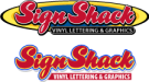
Sign Shack logo idea
Reminds me of an old school Surfboard logo. it is hard to read though...- GRAFIKWORX
- Post #9
- Forum: Logo Design
-
Boat Graphic Designs
:thankyou: you all for the nice compliments .. I have many more if you care to see some of them.- GRAFIKWORX
- Post #22
- Forum: Designs & Layouts
-
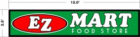
Helllpp
Maybe make EZ MART half the size,, and FOOD STORE triple the size. what is the more important message to get across out of those 4 words? the colors are fine ...- GRAFIKWORX
- Post #5
- Forum: Designs & Layouts
-

Advice
Mission Accomplished.. Nice to see someone head some good advice on here and not get all pissy. I hope it all works out for you.. "NEXT"- GRAFIKWORX
- Post #21
- Forum: Logo Design