• I want to thank all the members that have upgraded your accounts. I truly appreciate your support of the site monetarily. Supporting the site keeps this site up and running as a lot of work daily goes on behind the scenes. Click to Support Signs101 ...

New Van Wrap

ucmj22

New Member
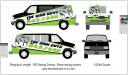
We are finally getting around to wrapping our other van so I threw this together today. its a simple vector layout with the brand as big as possible (taking a cue from Dan Antonelli) I wanted it to at least look similar to our other van. Should I do some more, or stop tinkering and let it be?
 

Attachments

  • Screen shot 2011-10-12 at 3.29.01 PM.png
    Screen shot 2011-10-12 at 3.29.01 PM.png
    154.6 KB · Views: 113

signmeup

New Member
The phone # is bigger than the company name. The cargo van is is great! I would try to get a little closer to that layout.
 

SignStudent

New Member
The kerning on the phone number between 7 and 4 needs adjusting.

Also, you might want to think about adding something to the hood.
 

ucmj22

New Member
Good start but I don't think it's right yet...

I know I need to rework the back, but I was relatively content with the sides, save for kerning and other finishing touches. I've been known to design for hours on end before reverting back to a simpler design so I was trying to stop myself before I got out of hand, but if the consensus is to keep moving, moving on I shall!
 

Ponto

New Member
...lotsa' conflicting angles...but aside from that, I like the simplicity.....it's a quick read....

JP
 

GRAFIKWORX

New Member
I like your Other Van A LOT BETTER.... this one looks weak in the middle with the black top and green bottom. maybe put the black in the middle white on top. smaller number, too many angles going on, just my opinion.. I think you can and will do a lot better..
 

ucmj22

New Member
I will have to work on it tomorrow maybe, since someone spilled coffee on my keyboard yesterday I can not HotKey>undo which I use a lot in Illy and just makes me angry now that I cant. If I could, first thing I would do is Undo the angles on the sides.
 

signage

New Member
Payday is late again. Should I just go home at lunch, and not come back until they have a check, or a Dir. Dep. drops in my account?

After this post I thought you were looking for a new job, or is this just going to be an ongoing complaint by you?
 

ucmj22

New Member
After this post I thought you were looking for a new job, or is this just going to be an ongoing complaint by you?

I am looking for a new job. But until I have one I will continue to do My best here. Just that damn midwestern work ethic I guess. checks didn't come in last friday either. It didn't drop in my account until yesterday, which is why today is my first day in the office this week (doesn't hurt me any, I'm salary)! I wont come in anymore until the money is in the bank.
 

grafixemporium

New Member
I like your original van design much better. It is much more impactful that the new design. I tend to think having 2 of those identical designs on the road or parked side by side would be much more effective than wrapping the new van with a completely different, slightly understated design.

One of the most important things about branding that seems to be often overlooked... consistency.
 

Tifosi

New Member
I like your original van design much better. It is much more impactful that the new design. I tend to think having 2 of those identical designs on the road or parked side by side would be much more effective than wrapping the new van with a completely different, slightly understated design.

One of the most important things about branding that seems to be often overlooked... consistency.

+1

People will see the two vans as one and think that you guys are everywhere and that is very eye catching. They will also see your vans and know who they are immediately.
 

Dan Antonelli

New Member
I like the original better as well. But like others noted here, I think web site addy is more important than the phone number. The original design is a really neat approach - and it does stand out among the clutter because its unique.

I think the design you got some inspiration from worked for that HVAC company - and we were especially pushing a fleet look mentality, but your applications I'm not sure its works because the objectives are slightly different.
 

ucmj22

New Member
I brought in my keyboard from home so I could CMD+Z again and worked on it some more. I was going for a different design because that is what the owner was pushing for, But if the consensus is for the old one, I will just do that. Ive got a couple of weeks before they are back in the office anyway, so they will just have to deal with whatever I do.

Thanks For all the input!:thankyou:
 

Attachments

  • Screen shot 2011-10-13 at 11.24.36 AM.png
    Screen shot 2011-10-13 at 11.24.36 AM.png
    100.6 KB · Views: 94

HulkSmash

New Member
I brought in my keyboard from home so I could CMD+Z again and worked on it some more. I was going for a different design because that is what the owner was pushing for, But if the consensus is for the old one, I will just do that. Ive got a couple of weeks before they are back in the office anyway, so they will just have to deal with whatever I do.

Thanks For all the input!:thankyou:

I Like this one. Good job.
 

grafixemporium

New Member
Was hearing it from Dan the Man himself not enough? The original design is still leaps and bounds more effective than your new (boring) direction.
 
Top