• I want to thank all the members that have upgraded your accounts. I truly appreciate your support of the site monetarily. Supporting the site keeps this site up and running as a lot of work daily goes on behind the scenes. Click to Support Signs101 ...

another logo

SignManiac

New Member
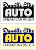
Here's three very simple takes on it. There are a million possible designs you can come up with. But first, as said before, find out what the client is before you begin.

All the tag line stuff can go on a sign or in ads, but the name needs to be kept simple..
 

Attachments

  • EliteAuto.jpg
    EliteAuto.jpg
    652.7 KB · Views: 109

tintshopplus

New Member
these folks are pre-owned car dealers. however, their niche is they will find it if its not in inventory or if its a hard to find piece. will only be local. signs are super close but face perpendicular to a very busy street. not a lot of time for folks to read as they're going by at 40 mph. mgr only request was no pic of a car (what's there now) on the sign or logo. it will be on a 3-4' x 8' substrate and 2 2' x 4' banners. no printing. vinyl cut only.

thank you all for your input. i'm having fun with this type of work, but i've got a lot of learning to do. and i tend to overthink at times. i know with a logo, simplicity is key. but, i want to give custys something different than the next guy.
 

Jillbeans

New Member
Todd said it all, I couldn't add a thing.
Except an idea.
Love....Jill
 

Attachments

  • Graphic1.jpg
    Graphic1.jpg
    67.2 KB · Views: 114

tintshopplus

New Member
well, here's what i've come up with. using my original idea and inspired by circleville i went with this. custy loves it. looks more streamline and not so cliparty. looks good in black and white or color. you guys make pick my fonts apart here, but i used what i've learned here to put it together. taking a little something from every one. let me know what you think. and thanks again for taking time to reply. means a lot to a noob.:U Rock:

Elite_Auto_Logo3.jpg
 

ndemond

New Member
Had a little time this morning, played with it a bit. Thinking AUTO should be the focal point. Spacing is a little off and Danville on top needs to be longer.

Just a thought.

Nancy


ELITE_AUTO.jpg
 

signmeup

New Member
Nothing will ever look good named "Danville Elite Auto". Give the place some class. If it's truely "elite" it needs to sound a little less "hillbilly".

I'd keep it simple.
(and don't stretch your fonts)
 

Attachments

  • EliteAuto.jpg
    EliteAuto.jpg
    17.8 KB · Views: 112
Last edited:

tintshopplus

New Member
so we're changing the name of the business? not sure that will go over well with my custy. this guy's middle eastern, but the rest of us are hillbillies. sounds like i'm on track after all.
 

signmeup

New Member
Don't get your nickers in a twist. Here's the original title.
You can gleen whatever you want from posted suggestions.
Here's one now..... I suggest you keep working on your logo.
 

Attachments

  • EliteAuto4.jpg
    EliteAuto4.jpg
    17.6 KB · Views: 103

tintshopplus

New Member
Don't get your nickers in a twist. Here's the original title.
You can gleen whatever you want from posted suggestions.
Here's one now..... I suggest you keep working on your logo.

oh i'm with ya man. what do you find wrong with the last one i posted? other than stretching fonts.
 

signmeup

New Member
You have mixed different fonts together that don't really go together. The two different italic fonts are the main problem. The slant should be the same for both. Serpentine is a semi-serifed font that clashes with the other rounded serif font. It would be a lot better to stick to just 2 fonts that were the same level of formality. I divided it up into "where" and "what". "Where" being Danville and "what" being Elite Auto. It's not "Danville Elite".....Auto. Elite describes Auto....... not Danville. By breaking it into 3 fonts you imply there are three things being described. You only have two things...."Danville" and "Elite Auto". Hope I'm making sense. Perhaps someone more eloquent can explain it better.

I also think you should prioritize the words in order of importance. The viewer will figure out they are in Danville quite easily so it can move back a bit in level of importance. "Auto" is the main point. A nice script font for Danville and a bold display font for Elite Auto should give you decent logo. Brush script is a font with poor legibility. You should check out A&E fonts for some good script fonts. Steve c is a merchant member on this site. He'll help you out with some good font recomendations.
 

tintshopplus

New Member
thank you for that response. i'll get to the fonts. and i learned something from how you put that together for me. emphasis and fonts together weren't even considered. so am i think colors and graphic are ok then? or is this another back to the drawing board situation?
 
if this is something you are going to persue further, as i mentioned in your other post..it would be money well spent to invest in some books on design theory and learn the basics. it would also be money well spent to invest in professional fonts a great and affordable source is the signfonts advertised right here at signs101 a great value for starting your collection of professional fonts.
 

signmeup

New Member
It's better but the fonts aren't working together. Try unstretching the Eras. I liked your steering wheel in the O idea better.
 

TheSellOut

New Member
I agree with SignMe! I think your layouts have improved greatly though:thumb:

SignMe I really liked your layouts, especially th font for "Elite Auto"...what is it?!
 
Top