• I want to thank all the members that have upgraded your accounts. I truly appreciate your support of the site monetarily. Supporting the site keeps this site up and running as a lot of work daily goes on behind the scenes. Click to Support Signs101 ...

another logo

Salmoneye

New Member
This isn't a logo it is a sign. Too much info and by the time you reduced this down to go on let's say a business card you would not be able to read a thing.
 

Marco

New Member
Logo

Perhaps outline in gold and blue interior. I like the steering wheel and maybe a wheel under it.
 

Dave Drane

New Member
Gotta love Brush Script......NOT!!! I think this one needs to go back to the start where the steering wheel began. That is the best design element, and take it from there.
 

Todd-sta

New Member
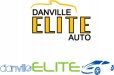
Oy... where to start?!

Kudos for putting yourself out there for critique... but this logo has a lot of layout problems and very little visual appeal.

But instead of just stating this and leaving the thread, I'm going to try and enumerate a few constructive points which I hope you'll take into consideration:

Fonts - It's generally a mistake to use Brush Script, as the others have noted. It's an unattractive font used to excess, much to the visual pain of any decent designer. It's mere presence calls into question the business's legitimacy and shouts 'low-class establishment.'

Mixing a script font with two other 'serifed' fonts is almost always a visual nightmare. Generally speaking, if you're using a script or serifed font in the business/or headline title... you should use non-serifed fonts for the balance of the message.... and then, you should try to keep the total font selections within the logo/sign to not more than 2 or 3 as to keep it clean and cohesive.

Using a myriad of different fonts is akin to using every transition available in a PowerPoint Slide-show...it's tacky, visually offensive, and shows a lack of professional design skill.

Additional Note Regarding Font Choices - I have NEVER seen an instance yet where the font you used for the word "Elite" EVER looked good.... to me, that font (forget what it is called) is as bad a choice in a layout as Brush Script. Font choices should not be taken lightly - they should be very carefully considered as fonts all exude a very unique personality that either supports or compromises the visual effectiveness of a layout.

Outline/Stroke Weight - shown around the word "Elite" is excessive. Doubling the weight of a font stroke generally causes legibility issues...and well, just plain looks grotesque. Not in every instance, but probably 80% of the time. Don't get caught in Outline Overload Mode.

Steering Wheel - This is a very "ho-key" way of treating a logo; people don't need a car part to determine that the business is auto related. If you want a supporting image to help connect the name of the business, consider having the image be size/fashioned so that it has a secondary emphasis. Perhaps use the image as a much smaller icon to go *along* with the business name.... like the *L* icon used with the word Lexus, etc. Don't necessarily make the icon the overpowering focus. As it stands, a big 'ol steering wheel makes me think more of a redneck go-cart track out in the woods somewhere. Sorry - but that's what I perceive.

Also, the wheel itself could be less clip-arty.... something more stylized. The one shown looks like the first practice run at figuring out how to create vector shapes with CorelDraw...it just looks very flat and lifeless.

Copy Emphasis - Danville Elite Auto have roughly the same visual emphasis, yet are completely disjointed from one another by virtue of the difference in font sizes, colors, angles, outlines, etc. What do you want the main emphasis to be? If it were me, I'd probably have 'Elite Auto' as the most prominent font/style (using the same font, color, etc for those two words) and Danville a smaller element positioned above (either flush left or centered above "Elite Auto")

The other descriptive copy should be positioned together below the Business Name.... why do you have it separated on opposite ends of the logo? Simply because there is an open space in the steering wheel one would presume...but this reasoning shows an elementary awareness of design layout in my opinion.

Colors - eh.... kinda so-so. They're just *ok.* Don't get stuck in the conceptual rut of thinking that a word such as "Elite" or any other upscale term requires the use of the color "GOLD" to prove that's it's Beverly Hills calibre...especially if the business is located in a small town rural setting.

Well, I hope this has been taken as constructive advice...I know it's not fun to be negatively reviewed, but if you take the advice of more experienced signmakers to heart, you will begin to show progress and ultimately be happier with your results.

Back to the drawing board, and good luck.
 

tintshopplus

New Member
thank you for that awesome reply. constructive advice is why i'm here. i know i'm a noob to signs. so it would be hard to hurt my feelings by telling me what i'm doing wrong. the brush script was a poor choice. seemed ok at 2:00am when i done it. but the next morning i realized it was the same font a lot of the car dealers in my area are already using. i am driven to learn and to be the best at anything i do. that's why i'm here. getting a spanking isn't so bad when you know you deserve it. i want to figure out what fonts to use and not use... and when to use (or not to use) them. i got a font cd and installed it. but after an hour of looking through and choosing the ones i liked they all started running together. do most designers use certain fonts for all jobs? or do they strive to be original on every application? anyway, i agree with malkin and gypsy - great response. and thanks again. i'll give it another try. this was more of a sign design than a logo. but i want to focus on learning some logo skills and give this custy something nice.
 

Marco

New Member
Logo

See attached logo. Signs101 3.jpg
 

noregrets

New Member
This is just a quick rough example of what I would start with......my design skills pail in comparison to a lot of people on here, and I can guarantee you that others will come up with something better - but you have the right attitute, so take in what people are saying and you will eventually get there....

Start off in black and white and get your layout right first, then play with your colours later...

When I look back at some of my earlier designs I do wonder what I was thinking.....

hope this helps
 

Attachments

  • example.jpg
    example.jpg
    25.5 KB · Views: 98

washingtonsignguy

New Member
Just a tip. Whenever i start to design a logo I always look at the name and figure out what word really describes the business, and then when designing, i really try to make that word the first thing people see. I feel Auto is the word in this case. Something else I have noticed when working at 2 am, mistakes get made.
 

tintshopplus

New Member
here's a quick change. i feel like i'm getting closer... but when shrinking this down the steering wheel will probably look like a booger on a biz card.:doh:

Elite_Auto_Logo2.gif
 

Dave Drane

New Member
I don't really think there was anything wrong with your original steering wheel, except the colors. Circles sometimes make a great logo..
 

tintshopplus

New Member
yeah, not the blue i'm really after. but, i'm still learning corel and playing mostly. i like blue/white for this logo because it's the town's school colors and i thought it would be a good idea for him because he incorporates the town name in the biz name, and it made sense for branding reasons. i like your steering wheel better than mine. it's more centered. i'll try it.
 

Circleville Signs

New Member
What does your customer do? Is he a car dealer? Broker? Does he work on consignment, finding "dream" cars for people (high end sports cars, etc.)? Is he wanting to stay local, or expand regionally/nationally? Who is his target customer? What are their demographic statistics?

People tend to think that logo design is just the "creative" side. Really, there is a TON more work on the front end, understanding what the customers goals are and who his target is, than the actual putting "pen to paper" time.

Answer THOSE questions. Once you've answered them, you need to make sure that the logo VISUALLY (not through font choices, etc.) expresses that.

For example, I'm attaching two different ideas. Idea #1 assumes that this guy is a broker who helps people find their high end dream cars. The target customer for this guy is a married male, 35-55, with an income of $75k+ individually or $140k+ houshold.

#2 assumes that this guy is a broker who helps people find their dream car - but the people are 16-14 year olds with rich mommies and daddies who like to tweak out old acuras and civics.


The point is - unless you take the time to learn ALL this info and more, you will NEVER give the customer the right logo in the end.
 

Attachments

  • danville.jpg
    danville.jpg
    14.3 KB · Views: 94
Top