crystalcoastgraphics
New Member
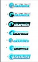
So we were wanting to redo our logo, and decided to go with Phillip at Sign Amigo for some help. It's always hard working on your own stuff. Below is our current logo, and a few sketches Phillip put together for something new. I just want to get some opinions on these and see what others think. I think out of the new ones I like 1 and 7 the most. I do like the wave idea just not sure if I like those waves. "Crystal Coast" is what our area is called so I'm sure a lot of you wouldn't get that part. And with us being on the coast, that is where the waves come from and the idea was a double C made with the waves.
Just looking for some ideas and criticism. Thanks again in advance!
Just looking for some ideas and criticism. Thanks again in advance!