• I want to thank all the members that have upgraded your accounts. I truly appreciate your support of the site monetarily. Supporting the site keeps this site up and running as a lot of work daily goes on behind the scenes. Click to Support Signs101 ...

Balloons and Banners...Hit a wall on this one...

neato

New Member
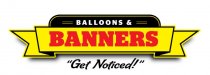
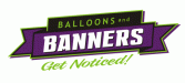
This is for a customer who is trying to get away from doing as much with balloons and is heading toward doing more with banners and signs.

I'm having a hard, hard time with this. The customer would like to downplay the balloons aspect of the logo and doesn't want the logo to be too 'fun'.

I'm having a hard time getting my brain to not design something fun and bouncy with the word 'Balloon' being the beginning of the name. lol.

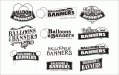
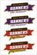
The B/W were initial quick thumbnails...the colored are a design we sort of settled on...but neither the customer nor I are happy with it.

Any thoughts?
 

Attachments

  • Balloons&Banners.gif
    Balloons&Banners.gif
    78.1 KB · Views: 130
  • Balloons&Banners3.jpg
    Balloons&Banners3.jpg
    74.6 KB · Views: 88

SignManiac

New Member
Man I think you nailed it with the far right b/w top row. I don't see why he won't go with the balloon when after all, he is selling both balloons and banners? That one design looks good, easy to read, and pretty much says it all.
 

neato

New Member
Thanks. I think it was just too 'balloony'. (not a word)

The customer has informed me that they are happy with the overall layout of the final colorized versions. But it's not quite doing it for them. Maybe it's a color issue?

Any thoughts on tweaking the colors???
 

SignManiac

New Member
Try your third one down in the color version with some other colors. I like the balance and readability best on that one.
 

TheSellOut

New Member
I really like your b/w concepts...dang customers always have to be right!

I just had threw together a layout quickly to maybe try and help, with your outlines, shadows, and text, it might look nice!
 

Attachments

  • BB.jpg
    BB.jpg
    744.9 KB · Views: 88

Colin

New Member
If you use that top one, try the word "and" in the same script as you've used below. I could be wrong, but it looks like the word Balloons needs to be slanted about one degree more to match the word BANNERS. (?)

Looks good.
 

Sign Ninja

New Member
I'd ask the customer : \

Plus it appears you're killing yourself, overspending way too much time on one job. Figure out how much time you spent, with how much money you "made" and it's not going to be a very pretty number, I'd imagine.


But I liked top right, in the B&W, then down one.
 

TheSellOut

New Member
umm...I pretty suurree Neato has a good idea of the time it takes him and the money he is making!! Have you ever checked out his website and the work he does?!
 

rjpjr

New Member
But it's not quite doing it for them. Maybe it's a color issue?

Any thoughts on tweaking the colors???

Great work as usual!

I took some liberties with your excellent designs and messed with the colors. I thought the "Get Noticed" was a bit overpowering and seemed like it read as part of company name. After toying with it for a bit, this is where I ended up...
 

Attachments

  • Balloons-and-Banners.jpg
    Balloons-and-Banners.jpg
    28.9 KB · Views: 84

tcorn1965

New Member
Great work as usual!

I took some liberties with your excellent designs and messed with the colors. I thought the "Get Noticed" was a bit overpowering and seemed like it read as part of company name. After toying with it for a bit, this is where I ended up...

RJ,
As always, I am very impressed with your take on an idea!

Terry
 

signmeup

New Member
I like all the "sketches" but the one that does what you said the client wants the most is the far right second one down. It emphasizes banners over balloons just enough.
 

neato

New Member
Thanks for all the input. And I'm sorry for not responding sooner. Here's the final version of the logo the customer decided on.

And to Mosh: 99% of my work comes from Sign and Screenprinting shops. I consider myself just another wholesale provider. How many shops don't do their own printing, channel letters or router work? It doesn't make them less of a sign shop. They just know their strengths and weaknesses well. They do what they're capable of, and wholesalers like me and the Merchant Members here can fill in the rest.

This particular customer is capable of designing their own logo, but sometimes designing your own logo is the hardest and it's nice to get another perspective on things.
 

Attachments

  • Balloons&Banners5.gif
    Balloons&Banners5.gif
    13.6 KB · Views: 121
Top