-
I want to thank all the members that have upgraded your accounts. I truly appreciate your support of the site monetarily. Supporting the site keeps this site up and running as a lot of work daily goes on behind the scenes. Click to Support Signs101 ...
You are using an out of date browser. It may not display this or other websites correctly.
You should upgrade or use an alternative browser.
You should upgrade or use an alternative browser.
Brain lock...
- Thread starter Circleville Signs
- Start date
 These are just muses, he'll add in the logo and his own stuff after looking over the ones he likes, I'm sure.
Brandon708
New Member
OK - revision using suggestion of banner wrapping around the "J".
Make the top left scroll logo bigger and get rid of the lower right one.
Circleville Signs
New Member
Thanks for all of the fantastic suggestions everyone! I'm going to hammer out the final design tonight and will post it for consumption tomorrow ")

Circleville Signs
New Member
Flame,
What is that font you used on the last one?
What is that font you used on the last one?
WhiskeyDreamer
Professional Snow Ninja
JONES is too big!! Listen to Marlene.......
+1
that's why i like signmaniac's the most!
SignManiac
New Member
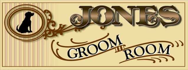
Fresh eyes this morning so I made a minor tweak. Just don't know when to stop I guess. Even the smallest, subtlest things can make a difference. I changed the Groom Room text from the same sized upper case to a larger initial letter with smaller upper case following. It changes the rhythm so it flows better with the scroll panel instead of a hard top visual line.
Hope that makes sense?
Hope that makes sense?