• I want to thank all the members that have upgraded your accounts. I truly appreciate your support of the site monetarily. Supporting the site keeps this site up and running as a lot of work daily goes on behind the scenes. Click to Support Signs101 ...

Company truck wrap design - Tear it apart!

401Graphics

New Member
So i've been trying to come up with a design to wrap my suburban.
Here is what i've come up with so far. Looking for your expert opinions on this.
If there is something you don't like about it, please follow up with a recommendation on how to fix it.
Thanks everyone! :U Rock::signs101:
 

Attachments

  • truckwrap.jpg
    truckwrap.jpg
    57.3 KB · Views: 194
  • truckwraphood.jpg
    truckwraphood.jpg
    107.8 KB · Views: 181
  • truckwraprear.jpg
    truckwraprear.jpg
    98.4 KB · Views: 154

visual800

Active Member
I really should not comment because all this looks like a POS crayon explosion. This is tacky, distracting and overall not in good taste. I have been disgusted with stuff like this sine they started doing it, but if you like it and it keeps work coming in , go for it.

now for layout. The splash of color is horrible, lose fb and twit logos, back is crowded and overall it does not let others know your a professional company. I think this whole "Angry ghetto fellers wrap club" has played out myself
 

John Butto

New Member
It does get your attention, and you do not seem to be afraid of color and you laid it out, so you must like it. For the wrap business that you are looking for, it probably will work because people who wrap their vehicles seem to like that look. So you will get five on here to tell you about kerning, five on your layout tweaks, and you already are getting the negative votes, but I like it overall, it is an eye turner.
 

401Graphics

New Member
ok so the background is bad. get rid of the fb and twitter logos.
The design is crowded, so what should be deleted or moved?
 

rjssigns

Active Member
I don't know what market you cater too. Your wrap may attract the exact client you're looking for while others will look elsewhere. My personal preference is for a clean look. I use Juice Drops for backgrounds, simple fractals or build one in PS or Illustrator.

Hook (visual presence)
Copy (what can you do for me?)
Contact (how do I "get me some")
 
My comment only concerns the copy. I'd ditch the web address under the phone number. You already have it 20x bigger on the doors. And I've never been a fan of "AND MORE."
 

OldPaint

New Member
this is a perfect example of the old tee shirt i had:
"IF YOU CANT DAZZLE EM WITH YOUR BRILLIANCE.........BAFFLE EM WITH BULL SCHIT))))))
you need to LEARN LAYOUT AND DESIGN SKILLS...........
 

bikecomedy

New Member
Would suggest this if this is your first company vehicle with a wrap to make the subject of the wrap your most profitable product or service. Select one of the three you listed, signs, wrap or t-shirts. Would select signs because the other two will follow from the wrap job naturally in conversations. Then would suggest making the background the best design you offer in that genre with the thought in mind that it will be the support for the message and not detract from the message. Definitely agree that you should make the background yourself. People will ask about it and you making it is important to the making you an expert in their minds. Agreeing with rjssigns on hooking the eye. Now pick a font that is unique but very readable from a distance for the product/service you are offering and contact info. Finally add your company name for those who can better remember your name and can't remember the contact info or those who will want to tell others.
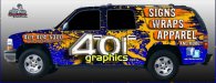
Current design hits
Bright and catches the eye.

Current design misses
Copy Hard to read from a distance
Subject of wrap is too small
Too many subjects offered
Back ground distracts from copy.

Here's something of a first draft for an example.

401 TRUCK DESIGN VER 1.jpg

To critique my own it may not be your market and the back is not done. You might make the background with brushes and other signs making tools embedded covertly in the design. This one upon close inspection has men and forest features in the background. It's very funny but some folks do close up inspections and find the covert stuff and love the surprise. Also it gives them something to say to others about subtleties and quality of your attention to detail.

Of course this is just an opinion and it is offered with good intention as help. Take what you wish and leave the rest. :)
 

Attachments

  • 401Graphics.png
    401Graphics.png
    85.8 KB · Views: 160

Craig Sjoquist

New Member
To me just getting rid of background would work for ya

John B. is also right if going after nich market just working on more contrast would help.

But for normal professional business needs & what is effective advertising...not a good example, because it is loud
 

Jester1167

Premium Subscriber
I'm not sure I would get rid of facebook and twitter. Social media is intertwined with SEO and it gives you a chance to secure a larger audience.
 

bikecomedy

New Member
Great point Jester1167... makes me wonder if there is a value in using these logos for the clients... Do we assume that a business has these things now and do our clients? The logos do not seem to provide the same service as the old Visa, Master Card etc. signs we used to use on the brick and mortar. What is the benefit of placing these on our vehicles? Definitely see the value in using links in email and web pages to and from these for SEO but Google doesn't know if the client has a Facebook or Twitter logo on their car, business card, flier, etc.

Sorry for being a thread pirate here.
 

SignManiac

New Member
Splash garish is how I perceive it. I like clean, crisp, strong logo with good contrast. Look at any of Dans vans. Very well done without all of the dated effects. If I were to invest the time and money into wrapping my own vehicle, I would take as much time as needed to make sure it was 100% tight and something I could live with for a long while. I'm sure that in time as your design skills improve, you will look back on this and cringe. Not a portfolio piece to be honest.
 

Locals Find!

New Member
I normally don't weigh in on this stuff but really?? that background needs to go. I am by no means a great designer or even a designer, but that background makes me think you drove your car through a paintball tournament then decided to add lettering to it.

I also don't like the effect on the logo. It just doesn't look right somehow can't put my finger on it exactly but, just not appealing.
 
Top