SignManiac
New Member
Umm, Adrian... I doubt that's likely going to happen?
That's some mighty big talk for someone who has yet to toss out their idea. Go on then.... dazzle us with your brilliance.
Umm, Adrian... I doubt that's likely going to happen?
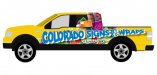
I'm not saying you would want anything similar... but my truck is similar & I had a tough time thinking of something... but when I did this for a live demo at the auto show, I was pleasantly surprised that I liked it for almost 3 years before I got tired of it:
http://islandsignmaui.com/wp- Zzzzzzzzzzzzzzzzz content/uploads/2009/09/42v.JPG

Zzzzzzzzzzzzz.
Why do you say that Bob? I can't wait to see what fabulous non-lame fonts he chooses. Maybe he makes his own like Jill. This should be a real treat!Umm, Adrian... I doubt that's likely going to happen?
I don't normally do this thing to prove myself and I know what I am capable of.Most of you are way to quick to assume here before you even see what others capabilities are.Why do you say that Bob? I can't wait to see what fabulous non-lame fonts he chooses. Maybe he makes his own like Jill. This should be a real treat!
I don't normally do this thing to prove myself and I know what I am capable of.Most of you are way to quick to assume here before you even see what others capabilities are.
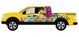
Here is just a very VERY quick idea for fonts and by no means does this have to be color choice.
Just an idea.
Have a great day everyone!
I am not a fan of the candy looking background.
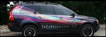
I went to your site and saw the on vehicle you have wrapped (or photoshopped)
Why not go with that same theme but invert the colors. Keep the yellow, add the background you have on that vehicle.