-
I want to thank all the members that have upgraded your accounts. I truly appreciate your support of the site monetarily. Supporting the site keeps this site up and running as a lot of work daily goes on behind the scenes. Click to Support Signs101 ...
You are using an out of date browser. It may not display this or other websites correctly.
You should upgrade or use an alternative browser.
You should upgrade or use an alternative browser.
Designing my logo. Opinions please
- Thread starter abadsvt
- Start date

animenick65
New Member
Honestly, even if you have some of the best skills in the world, your better off paying someone to design it for you. Someone who does this day in and day out, who is unbiased and can take your ideas in both logo design and how you want your business to come across and make something truly fantastic for you. Just my $.02.
iSign
New Member
write 100 words about you, your business, your skills, your strengths, your weaknesses, your clients, your hopes & dreams for the direction your business will go, & your current marketing in use (if any) as well as any important likes/dislikes in terms of graphics, colors etc...
...then ask for our opinion on your logo.
These are just some of the things you should know when designing (or critiquing) a logo for someone...
in fact, check out THIS blog post I borrowed!
...then ask for our opinion on your logo.
These are just some of the things you should know when designing (or critiquing) a logo for someone...
in fact, check out THIS blog post I borrowed!
Craig Sjoquist
New Member
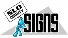
I like the way it read as a thumbnail bam SIGNS .then SLO County then what looks like a someone walking .. don't get that but ...it sure read well as far as layout that's the way to do it, you want your eye to move like that in someway and you got it.
This is where ya your starting to form a brand, so sleep on it a bit
the top line would have more contrast if ya used a serif font VS sans serif font signs,
Which I may ask what font does the county of Slo use .. would use that localizes it better then contrast that
the little guy walking put you as a sign walker company ? but I liked the walker carrying the name
, if not probably change that idea
SignManiac
New Member
SignManiac
New Member
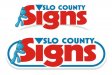
Thanks Doug, makes sense now. California town.

ericmitchell29
New Member
")


Thanks for all your opinions! I really appreciate it!
Someone asked what we do. We are a regular sign shop that does banners, vinyl plotting and printing, and started getting into vehicle wraps. We also do some sign installation.
Thanks Mosh and Jmanes7 for ideas. Jmanes7 I like the little guy holding the sign with the phone #. Great idea. Mosh I REALLY like that logo! What font is that? Like the colors and everything about it. GREAT JOB!
Thanks again guys!
Josh
SignManiac
New Member

iSign
New Member
write 100 words about you, your business, your skills, your strengths, your weaknesses, your clients, your hopes & dreams for the direction your business will go, & your current marketing in use (if any) as well as any important likes/dislikes in terms of graphics, colors etc...
or don't