-
I want to thank all the members that have upgraded your accounts. I truly appreciate your support of the site monetarily. Supporting the site keeps this site up and running as a lot of work daily goes on behind the scenes. Click to Support Signs101 ...
You are using an out of date browser. It may not display this or other websites correctly.
You should upgrade or use an alternative browser.
You should upgrade or use an alternative browser.
New Product Digital design/ tea company
- Thread starter Sidney
- Start date
Is package design something you are experienced in?
Is this for a sign or a label?
The product name and its producer is so understated that I'd be hard pressed to choose it off the shelf at the store.
It seems like you spent 13.50 hours on the illustration and .50 hours on the text to describe and name the product.
Emphasizing the product a lot more would really help.
Texas_Signmaker
Very Active Signmaker
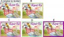
Another vague question with very little put forth in articulating ones need. What is this design for? Looks like 5 of the same designs with a different border.
Sidney
New Member
It will be for signage and labels. You are correct.....This customer's main focus has always been visual impact/draw with simple Titles. There may be some additional text (tbd). Also, he is the exclusive supplier of coffee and tea at these stores.Is package design something you are experienced in?
Is this for a sign or a label?
The product name and its producer is so understated that I'd be hard pressed to choose it off the shelf at the store.
It seems like you spent 13.50 hours on the illustration and .50 hours on the text to describe and name the product.
Emphasizing the product a lot more would really help.
Thank you for your input I truly appreciate it.
Sidney
")
Texas_Signmaker
Very Active Signmaker
I really dont get or like the design. Looks like something for old stuffy perfume women. The name is in cursive and is like 10% of the whole thing. It's very busy and too many colors.
Maybe try researching product labels or go to the gas station and get some ideas. I know when I present options to a client, I give them DIFFERANT options, not just the same one with differant border.
Maybe try researching product labels or go to the gas station and get some ideas. I know when I present options to a client, I give them DIFFERANT options, not just the same one with differant border.
Sidney
New Member
Yes, it is the same design. It's the final one he chose with different border colors.Another vague question with very little put forth in articulating ones need. What is this design for? Looks like 5 of the same designs with a different border.
It will be for signage and labels. You are correct.....This customer's main focus has always been visual impact/draw with simple Titles. There may be some additional text (tbd). Also, he is the exclusive supplier of coffee and tea at these stores.
Thank you for your input I truly appreciate it.
Sidney
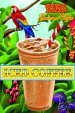
Regardless of the exclusivity of the distribution of the product, potential purchasers shouldn't have to hunt around the label for what it is you're trying to sell them.
Unless we're missing something here like the bottom area below the bridge being filked with the individual variety of tea in the box, the entire concept while having a well done illustration, leaves me uninspired to buy a box due to its lack of clear visual cues of what is being sold.
James Burke
Being a grandpa is more fun than working

Sidney
New Member
Thank you for your input. SidneyRegardless of the exclusivity of the distribution of the product, potential purchasers shouldn't have to hunt around the label for what it is you're trying to sell them.
Unless we're missing something here like the bottom area below the bridge being filked with the individual variety of tea in the box, the entire concept while having a well done illustration, leaves me uninspired to buy a box due to its lack of clear visual cues of what is being sold.
Sidney
New Member
It definitely is a feminine design. Totally appreciate your honesty. SidneyI really dont get or like the design. Looks like something for old stuffy perfume women. The name is in cursive and is like 10% of the whole thing. It's very busy and too many colors.
Maybe try researching product labels or go to the gas station and get some ideas. I know when I present options to a client, I give them DIFFERANT options, not just the same one with differant border.
Sidney
New Member
Tim, good points. Here are a few other designs for his product line.Regardless of the exclusivity of the distribution of the product, potential purchasers shouldn't have to hunt around the label for what it is you're trying to sell them.
Unless we're missing something here like the bottom area below the bridge being filked with the individual variety of tea in the box, the entire concept while having a well done illustration, leaves me uninspired to buy a box due to its lack of clear visual cues of what is being sold.
Attachments


Sidney
New Member
James, You are so right. I have done work for this company for 20 years and no matter how many times I make Scarlet Macaw play a more prominent role, he always wants it reduced. His brand name Scarlet Macaw is so well known in Long Island, NY, that it's the visual artistry that draws the attention (seems by now the customers know the quality of his products).Scarlet Macaw is the brand. Take a hint from Grandma and don't hide it.
Thank you, James
Texas_Signmaker
Very Active Signmaker
I just don't think any of those designs look good... Plus it would be easier if you could mock it up on the actual container. The container gives more of a whole picture.
Google "Beverage Labels" and look at what they have there. Most of the designs are easy to digest (lol, get it?)


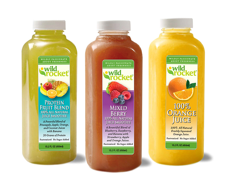
Google "Beverage Labels" and look at what they have there. Most of the designs are easy to digest (lol, get it?)
dale911
President
Tim, good points. Here are a few other designs for his product line.
I agree with the other guys. I hate all of these and would not buy a product with these labels. Guess he is only popular in Long Island because of lack of competition and he will never get bigger than Long Island because no one is going to pick this product when there is a better looking product sitting next to it. Product packaging is far more important than what it is or who the brand is. It has to appeal to the buyer and clearly stand out from the pack.
I think it’s time for you to hire a graphic designer...I believe the phrase “Sh*ts Weak” describes your branding ability to a Tea (see what I did there).Took 14 hours but I believe in done. Which one do you like?
Johnny Best
Active Member
I like the labels but I thought Tea in Long Island was rum, tequila, gin, triple sec and cola. Should have been a parrot on a Captain Morgan's shoulder.
Rick
Certified Enneadecagon Designer
I was just having a discussion with an illustrator about the gear he uses for his illustrations. He was working on some tea packaging and it was awesome. Your illustration looks appropriate for the product, (celestial seasonings comes to mind) but I can't say the same for the typography or how you layout the imagery with the type. The border does not seem appropriate. I would study other illustrations and border treatments, stay away from "sign shop" type and treatments. Otherwise, from what I can see, nice illustrations...
Billct2
Active Member
To answer your question "D"
To add to the critique, it took me a minute to figure out it was the birds wing wrapping around the cup. Lose the sleeve on the other wing so it's more obvious. Is that the color of
the tea, it's a really unappetizing shade. There's something going on with the other side of the bridge and the pagoda roof that is off perspective.
There's an old axiom that has existed since I started in '64: "Ours is the only trade (as designers and sign guys) where the customer is not always right..." I think it would be to the client's advantage to have listened to your input. Label priorities: Primary (logo, name), secondary (what are you selling?), last (all the other small info that just HAS to be there).
Gino
Premium Subscriber
The whole thing is a terrible idea from product recognition to the rendering of the artwork. You have 4 distinct light sources. Inside that's possible, but not outside, unless you're in a stadium. You have several ground perspective planes, your use of muted colors to brilliant do not match whatsoever and most of all.... your drawings are quite a bit wonky. Nothing matches up or is an easy flow.
This bird seems to be the center of focus. Is that by your choice or theirs ??
This bird seems to be the center of focus. Is that by your choice or theirs ??