-
I want to thank all the members that have upgraded your accounts. I truly appreciate your support of the site monetarily. Supporting the site keeps this site up and running as a lot of work daily goes on behind the scenes. Click to Support Signs101 ...
You are using an out of date browser. It may not display this or other websites correctly.
You should upgrade or use an alternative browser.
You should upgrade or use an alternative browser.
don't beat me up too bad
- Thread starter ExtremeGFX
- Start date

ExtremeGFX
New Member

401Graphics
New Member
both hard to read. especially from a distance
ExtremeGFX
New Member
SignProPlus-Chip
New Member
I'll play devil's advocate here.
What makes your design/graphics work so "extreme" when you self admit to having difficulty doing design work?
If it's not your strong point, then why use a term like extreme to describe it?
Now as for the actual design, the first version has the "X" shoehorned into the other text, which BTW is spaced out horribly. Just look at all of the dead space between the "E" and "X". The font used for the "X" is weak in stature compared to the other text...they just don't work well together.
Drop out all of the effects and design in B&W first. Get your design balanced with the fonts you want, then star adding your colors and effects.
visual800
Active Member
First off lets all try and stop with the "Angry Look" it's been way over played and although Im no profit I think there is a steep decline in all the angry/agressive wraps and logos. Only flip letters if its to make a point or "even out" a logo. You already did the "x" in a different font so I would leave it at that
The three fonts you have used do not match or compliment the others at all. When I look at your logo my eyes are all over the place and I dont quite know whats going on. Something can still look nice, clean and be a little agressive
try something like the one below simple
The three fonts you have used do not match or compliment the others at all. When I look at your logo my eyes are all over the place and I dont quite know whats going on. Something can still look nice, clean and be a little agressive
try something like the one below simple
Attachments
![Untitled [Converted].jpg](/data/attachments/67/67766-2ab9895e2454a1df787fa3031decbd72.jpg)
Last edited:
Craig Sjoquist
New Member
Liked the 1st one way better then 2nd.
Only problem I see was the ..X
Likes the backwards...E even the fonts use on 1st one was good contrast.
Like Chip says work in B & W 1st
Only problem I see was the ..X
Likes the backwards...E even the fonts use on 1st one was good contrast.
Like Chip says work in B & W 1st
Gino
Premium Subscriber
I'm just happy to see you not use an 'X' in the word graphics.
When designing or putting ideas together and it's not your strong suit as pointed out.... try making up 5 or 6 ideas and slowly piecing together things you like and discarding things you do't like. Also, always design or layout in black & white. You won't confuse yourself with value or worthless combinations.
When designing or putting ideas together and it's not your strong suit as pointed out.... try making up 5 or 6 ideas and slowly piecing together things you like and discarding things you do't like. Also, always design or layout in black & white. You won't confuse yourself with value or worthless combinations.
Jillbeans
New Member
To be honest, both are atrocious.
As had been said, no need to flip the E.
The top one is ridiculous with the skinny X and the 80s fonts.
But then you add insult to injury in the second attempt with that horrid X and the childlike script that looks like Comic Sans with diarrhea.
The colors are especially noxious on this one too.
Another thing...you don't have to outline everything.
Try sketching out something with a pencil or a Sharpie until you get the feel you want.
Then import it into your design program and search for a font that fits the bill.
Do all this in black and white before you even think of adding color.
I don't want to rip on your name, which might have some merit in the motocross or racing world, but I would try to think of a business name that will stand the test of time.
Kudos for not using an X in graphics, and for using a grey drop shadow in your second layout. And for not using every fill known to man.
I think a slashy script for the name might be nice, with Graphics the part that stands out, because that is what you are trying to sell.
Beyond that, I'd start over again or hire out the logo design.
Love.....Jill
bob
It's better to have two hands than one glove.
What Jill said.
The only thing you did right in these examples is, as previously noted, spell 'graphics' properly.
You might reconsider using the word 'extreme' at all. It's right up there with 'turbo', 'platinum', 'precision', 'XL', and a host of other meaningless throw-away descriptors. Something like "Hoserville Signs" [or whatever the name of your village might be] and 'signs' instead of 'graphics'** sounds like a firm populated by mature journeymen, not wannabe children.
**I admit to violating this principle. My own business is 'Practical Graphics". A paraphrase of the movie title 'Practical Magic' with exactly the same meter and, since I already have a sufficient following, attracting business doesn't mean much to me. I just need something to put on the business license and seller's permit.
Jillbeans
New Member
OK really quick idea
(I am in the middle of doing something really dull and I needed a break)
These are Steve C's Signfonts Cardiak and Poster Deco. I took the E from one and flipped it to make an icon, and stuck an X in there too.
Then I trimmed it up a bit.
I didn't want you to think I was a total b!tch.
But your logo can use some TLC.
Attachments

ExtremeGFX
New Member
thank you for all of the input. I will keep working on it taking everything you guys have mentioned in mind. If i were doing this for a customer i would hire someone to design the logo because it is not my strong point, but since im doing it for myself i figured to give it a shot. I used the word extreme because of the businesses i have been dealing with. The name is not that important to me because i also already have the work flowing in as well, just need it for tax reasons as bob stated. I will give it some more thought though. Who knows what kind of customers i will be dealing with in the future. Once again thank you all for giving your $.02
ExtremeGFX
New Member
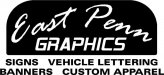
the worst part is I let other people talk me in to the Extreme Graphics name. My favorite idea was East Penn Graphics but a few people told me it was dull and Extreme was better. I have to give it some ore thought i guess.
ExtremeGFX
New Member
ExtremeGFX
New Member
seems too simple to me though
fmg
New Member
No doubt about that.I'd say back to the drawing board.