-
I want to thank all the members that have upgraded your accounts. I truly appreciate your support of the site monetarily. Supporting the site keeps this site up and running as a lot of work daily goes on behind the scenes. Click to Support Signs101 ...
You are using an out of date browser. It may not display this or other websites correctly.
You should upgrade or use an alternative browser.
You should upgrade or use an alternative browser.
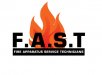
Fire Logo
- Thread starter laserman70
- Start date

Jillbeans
New Member
No.
Not with the prismatic font anyway.
The contrast between the two colors (or the greyish black and the orange blend) really bugs me.
Like when someone uses a prismatic font and makes one part yellow and the other part blue.
If you are going to use a prismatic font make the tones on it look as if the sun was actually shining on it.
But in this logo I think having a prismatic font is too much.
On your subcopy you need to choose a more pleasing letterstyle like Arroyo.
I dislike the slanted endings on that one and the kerning is wonky.
Love....Jill
tonywhittier
New Member
looks good but for a logo i wouldn't have so much detail in the logo...
I would make the flames come off left side and skew FAST to make it look like its going some where
I would make the flames come off left side and skew FAST to make it look like its going some where
SignaramaFL
New Member
I think there is way too much going on
SignManiac
New Member
The bottom line needs to be squished another 50% to make it thinner yet. Then it can breathe properly.
")

SignManiac
New Member
Some people might consider me crazy, but I try to design logos so they can be reproduced in a black and white version. In other words, I think it's to complicated.
Not crazy at all...That's how is should be done.
SignManiac
New Member

Locals Find!
New Member
SignManiac
New Member
Addie I have nothing to throw a fit about. I'm usually pretty straight up about how I feel on the subject of design.
Craig Sjoquist
New Member
I want to see how you improved the logo.

J Hill Designs
New Member
And if you use shading, do a better job than I did. lol.
...and also spell better =)
laserman70
New Member
Thanks for all the advice.
The client wants actual real flames in his logo.
I was trying to push him to less photographic and more vector art style.
The client wants actual real flames in his logo.
I was trying to push him to less photographic and more vector art style.
J Hill Designs
New Member
well the fire aint too bad in my opinion, but it reflecting off the chisel is the problem -- a) the letters are in front of the fire, so why is the fire reflect off of the front of the letters? b) contrast/readibily issue mentioned above
iSign
New Member
Thanks for all the advice.
The client wants actual real flames in his logo.
I was trying to push him to less photographic and more vector art style.
well, that's easy... just do with it what should be done with well over half the logos posted in these sort of threads...
...just print FIRE ijn black & white on some nice dry paper, call the client & when he starts to look at you like something is missing...
flick yer bic!
