• I want to thank all the members that have upgraded your accounts. I truly appreciate your support of the site monetarily. Supporting the site keeps this site up and running as a lot of work daily goes on behind the scenes. Click to Support Signs101 ...

Help on a layout. Give me your opinion please

signmeup

New Member
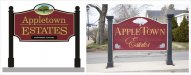
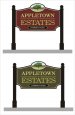
I think I've been looking at this for long enough. Anyone have any suggestions? The before is getting pretty ratty looking so they want me to make them a new one out of HDU. The pictorial will be carved. I can't decide if the pictorial is too big or needs to simplified or? The font doesn't thrill me either....suggestions appreciated. The size is 81 x 48 to 50 ish. The width is not negotiable but the height is. The little plaque at the bottom has to be flipped over when the units are all rented.
 

Attachments

  • APPLETOWNsm.jpg
    APPLETOWNsm.jpg
    41.3 KB · Views: 180

TheSellOut

New Member
Boy Signmeup, I think it looks great as is, font, shape, and all. The only thing that bugs me a little is the line between Appletown & Estates, what if it was white like the border or possibly a green from the pictorial? I don't think you would want to go any smaller, or any less simplified, on the pictorial either.

Nice work:thumb:
 

signmeup

New Member
Thanks Heath. That image posted up a lot smaller than I thought it would so I'm posting a bigger image of the exact same layout so it's easier to see.
 

Attachments

  • APPLETOWN2sm.jpg
    APPLETOWN2sm.jpg
    56.8 KB · Views: 144

SignManiac

New Member
Great start Signmeup. I'm not real keen on the start and ending larger letters in Estates and I would bump up the apartment panel so it doesn't relate to the edge on the bottom. Maybe give it a tad more breathing room. I always like a little beefier border too.

Here's something you might want to play with or use a part of? Not sure about the blue border but it picks up some of the colors in your oval graphic. Maybe if the post were painted in something close it would pull it all together.

Did you make the original sign? I think your new version is a big improvement.

BTW... you have Apartments spelled wrong.
 

Attachments

  • Appletown Estates.jpg
    Appletown Estates.jpg
    89.1 KB · Views: 140

Letterbox Mike

New Member
I completely agree with SignManiac, the "E" and "S" don't look right. I also don't like the broken line under "appletown", which IMO also looks awkward being caps and lowercase. His redesign I think hits the nail on the head for the main copy, but I like your scalloped lower corners.
 

signmeup

New Member
Man I must be getting tired. Thanks for catching that spelling mistake maniac. I like the teal border. Maybe I can use teal in the cream coloured groove? I made the E and S bigger to frame the little panel but I see now that I didn't centre it up very well. I would like to have a similar weight to Appletown as Estates but Appletown is so darned long I don't really quite know how to go about it. I tried it with all caps in the Century Schoolbook but I didn't like how it looked. It looks better with a curve than it did straight.

No, I didn't make the original one. It's 4 big boards glued together and its really going rotten after only 4 years.
 

SignManiac

New Member
Here you go SignMeUp, another variation...I tweaked the panel so the balance is improved with the rest of the elements.
 

Attachments

  • Appletown Estates.jpg
    Appletown Estates.jpg
    171.4 KB · Views: 123

Fitch

New Member
No disrespect to others, but I actually like the way you have submitted it.

If anything, yes the line between the "P"s gets me but thats just a case of bumping it up and increasing size. Problem solved.

I personally prefer to have a slightly larger (black) border and slightly thinner (cream)line, but all good.

Cheers - G
 

signmeup

New Member
Thanks for posting that up signmaniac. I was working on changing the font to all caps. It looks better to me now for some reason.Then I thought I'd try a few different colours. I really like the weird swamp green one. I think that colour would look awesome with the gold leaf.
 

Attachments

  • APPLETOWN3sm.jpg
    APPLETOWN3sm.jpg
    42.4 KB · Views: 130

mtmdesigns

New Member
I like the cut out of the bottom as well, maybe you can try putting the apartments available on some S hooks, and you can change things out etc. I dunno just a thought. Here is a "rough" sample. This will enable you to make the name bigger.
 

Attachments

  • hanger.jpg
    hanger.jpg
    35.9 KB · Views: 139

Jillbeans

New Member
I like the direction it went.
Like I said on another topic this week, I am tired of the old "big letter on each end" layout.
I like either background color, client will probably go with the first one.
Think APPLETOWN should be a tiny bit smaller like Bob & MTM depict it.
And it needs revolving lighted apples as finials on the posts.
:)
Love....Jill
 

signmeup

New Member
Thanks for the suggstion MTM. I have had terrible luck with hanging signs in this town. Kids steal them or destroy them. It would be a great way to deal with the changeable message required.
 

signmeup

New Member
Jill, I think the manufacturer of those revolving apples has gone bust. I can't find them anywhere. Maybe I can find some NOS on Ebay.
 

SignManiac

New Member
I'll throw out this one last variation with an alternative idea for a different text possibility and bottom panel so that it's not hanging but still attached to your sign. I do like the greens better.
 

Attachments

  • Appletown Estates2.jpg
    Appletown Estates2.jpg
    163.9 KB · Views: 161

JR's

New Member
I like the two barrels of apples in each corner. I think you should put that on the new sign.

All kidding aside I like all of them, but on the small oval sign raise that up just a little bit so it's not relating to the border. And on the lettering on the oval raise it up so it's not in the center, more or less optical center.

JR
 
Top