HeavyHitter
New Member
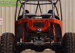
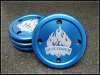
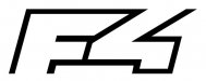
I have been going around and around with this project and have yet to come up with something I like. The black drop out area is supposed to represent the letter F in negative space.
Here is what I am after for the client:
1. Very Simple
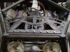
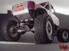
2. Can be laser cut out in steel plate to brand some of the items they are manufacturing. The black area in the image will be dropped out of the part in this case.
3. Can easily be tied back into their name. The main part of their name is Frontier. In this case I am using the letter F in negative space.
I am stuck on this one. I am open to ideas. Keep in mind I want to keep it very simple. I will be using this in conjunction with their name. This company is not McDonalds so they will have to work to establish this as a brand identity. If the shape becomes too complicated it will drive up cost to laser cut and make it more difficult to cut into small items.
Some other things to note. The client likes tattoo type artwork and grunge. In my opinion this logo needs to stay clean and leave a larger foot print for the company to grow with which the client understands. So... tattoo type artwork is not out of the question if we can keep it clean crisp and to the point.
Dan
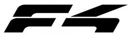
Here is what I am after for the client:
1. Very Simple
2. Can be laser cut out in steel plate to brand some of the items they are manufacturing. The black area in the image will be dropped out of the part in this case.
3. Can easily be tied back into their name. The main part of their name is Frontier. In this case I am using the letter F in negative space.
I am stuck on this one. I am open to ideas. Keep in mind I want to keep it very simple. I will be using this in conjunction with their name. This company is not McDonalds so they will have to work to establish this as a brand identity. If the shape becomes too complicated it will drive up cost to laser cut and make it more difficult to cut into small items.
Some other things to note. The client likes tattoo type artwork and grunge. In my opinion this logo needs to stay clean and leave a larger foot print for the company to grow with which the client understands. So... tattoo type artwork is not out of the question if we can keep it clean crisp and to the point.
Dan