• I want to thank all the members that have upgraded your accounts. I truly appreciate your support of the site monetarily. Supporting the site keeps this site up and running as a lot of work daily goes on behind the scenes. Click to Support Signs101 ...

I could use some help with this layout

GAC05

Quit buggin' me
Some times I feel like I know what I am doing and some times I feel like a hack.
This one is in the hacky camp.
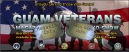
The group publishes the "Guam Veterans Magazine" and host a 1 hour weekly show to support the local vet population.
They wanted a single banner with both showcased to be used as a table wrap or backdrop inside a small pop-up tent during events.
So the viewing distance will be pretty much walk-up only.
I hand traced the silhouettes from a photo they provided (think it is off one of the .mil servers). The flag has some nice detail in it & is from Shutterstock.
The Vet guys driving the project like it, but they are too used to artwork coming from power point slides.
This is not a paid project but I still want it to look good.
Any suggestions are welcome.

Thanks all

wayne k
guam usa
 

Attachments

  • g-vet.jpg
    g-vet.jpg
    116.6 KB · Views: 89

SignManiac

New Member
You're close. You need to pull all your text together tighter. Basically background image and then your copy so it comes off as two elements.
 

jiarby

New Member
I do something like this now & then to tie up loose content. Add a bar!

There is a good flag on a juicedrop dvd... 5201 I think... I use it alot!
 

Attachments

  • 3-3-2010 5-39-24 PM.jpg
    3-3-2010 5-39-24 PM.jpg
    108.8 KB · Views: 74

TheSellOut

New Member
I like the layout but "Magazine" & "Radio Show" get lost to me, have you tried them in the yellow? Possibly with the gradient effect. Then change the information under those headlines to the lighter grey/white. Also, try moving magazine and radio in more towards the center of guam vets, moving them off of the faces of the guys crouched down. Right justify the info under Radio. Have the tried "Proudly Serving..." in a script?

These are just suggestions of things I would try if working on this layout
 

Tangent

New Member
The yellow text seems to be out of place. Just doesn't flow. Really like the background and the general concept.
 

Steve C.

New Member
It's an attractive banner just as it is. I would want to try moving the
GUAM VETERANS higher and maybe make the soldiers smaller so their heads
camd just below that line. Then move the to blocks on either side in to the
middle a little more. That may not ballance out any better, but I'd at least
want to try it.
:thumb:
 

acothran

New Member
Wayne, I like the design idea but there are two things that caught my eye in a strange way. I like the use of the armed force portals but they seem to throw off the balance. I would like to seem them a tad bigger and distributed evenly across the bottom of the banner. I also think that would show each branch as equal and not portray a hierarchy/totem pole effect. Also, "Proudly Serving Those Who Served" looks disconnected in the top right corner. My ideas may not work but the portals and that header text in the top right corner are throwing off the balance/symmetry for me.

Allen
 

cptcorn

adad
I think you need to increase the weight and contrast of the copy.

The only issue i have with it might stem from arrogance, but, if it's to target veterans in the Guam area, why are the soldiers holding modern weaponry? Not that it's a real issue at all. I think you might have too many main focal points.... You want people to recognize the seals, the flag, the soldiers, the text, etc... maybe you can drop one, and it might help clean it up nicely, without losing any of the impact.
 
Last edited:

iSign

New Member
The only issue i have with it might stem from arrogance, but, if it's to target veterans in the Guam area, why are the soldiers holding modern weaponry?

arrogance or did you mean ignorance? Guam soldiers fight today's wars, and yesterdays...
 

cptcorn

adad
arrogance or did you mean ignorance? Guam soldiers fight today's wars, and yesterdays...

Ignorance defiantly! I often misuse each word. I agree with your statement. My input stems more from the use of veterans. I'd hate to see an old timer think... "what is it that they're holding!?" Please the the eldest crowd first is my opinion when it comes to these sorts of topics. Make them feel appreciated and not as if you skipped over their legacy. It is interesting thought that a couple basic soldier like stances are so easily recognizable.
 

acothran

New Member
Wayne, I decided to put your pic in Photoshop and mess around some. It's late and I could only do so much with the clone tool, so it looks rough but it's just some ideas. I agree with CPTCorn in that there are a lot of focal points. I think it might help to tone the flag down a tad. Maybe try a white or black background behind it and drop the opacity 20% or so.

I moved the portals (seals) to the bottom and added a slight faded black gradient behind them. I put the top right corner sentence across the top center (never mind my font, I wasn't trying hard to match the font). I would move "Guam Veterans" up and possibly lighten it a tad, but that will depend on whether or not you lighten/darken the flag. Right now color tones kind of blend with the background.

Finally I had an idea of using some type of dog tags (outline or actual pic of dog tags) to display the magazine and radio info. It might not be possible to add that without overwhelming the banner but it might be fun to give it a try. Also if the "Guam Veterans" text matched the dog tags (i.e. same texture/colors) it would help to relate them all as part of the foreground. With dog tags you'd probably want make the text looked embossed to sell the effect. Might be an issue if reading from a distance but you said that wasn't the case w/ this banner. Also, I'm not sure if using dog tags in this manner would be considered degrading.

I like the idea of the banner and just wanted to attempt to visually share some of my ideas.

Allen
 

Attachments

  • Picture 13.jpg
    Picture 13.jpg
    48.2 KB · Views: 81

chatterbox

New Member
I would MOVE the Main Copy: GUAM VETS up more.

LINE all the Circles at the bottom, same size as they are.

Change the YELLOW subcopy to perhaps, WHITE, with a little bolder BLACK outline (Offset Path) around the copy. Make it bigger for readability even though most people don't read.
 

GAC05

Quit buggin' me
Keep them coming, I am listening.
The yellow lines of text are what look the worst to me - that is why I posted.
Here is the update using some of the ideas posted.

The image with the silhouettes came from the Vets themselves both that I talked to are from the Vietnam war so if it is OK with them it works for me.

thanks for everyone's help

wayne
 

Attachments

  • g-vet2.jpg
    g-vet2.jpg
    114.8 KB · Views: 77

TheSellOut

New Member
I had a few minutes so I played around and this is what a came up with!
 

Attachments

  • Guam.bmp
    750.1 KB · Views: 102

GAC05

Quit buggin' me
Thanks to all who offered up help here.
I especially appreciate you guys who took the time to rework the drawing.
There were some changes I would have liked to have used.
I had the the person handling project look at some of the changes to the layout and he said to print the first draft I put up here, with almost no change.

On to the next one.

wayne k
guam usa
 
Top