Wow, this site can humble a person pretty quick. When I designed this I was pretty proud and have had overwhelming great remarks from it. Already sold a few more wraps and it hasn't been on 24 hours yet. It's not even finished. Roof, bumper, phone number and web address need added.
That's Great news!
Let's cover some of the thoughts. First spelling of "Hygh" high octane graphics was already taken, by a lot of companies. Hygh is easy to remember and puts me top in google everytime.
Hygh puts you at the top of google? That's probably because no one would ever spell that way. Hygh is hardly a good mispelling for a company name. Graphix isn't really good either.
No one was really bashing the name, just that it is hard to read.. WHICH it is.
Plus how many graphics companies actually spell graphics right?
A lot actually.
More don't than do. Couldn't use my name because there is a high end amplifier company called jeff rowland, so I just went out of the box. "Hygh Octane" name came about because the majority of my work is in the Powersports/racing industry and now breaking into the wakeboarding tow boat market. Also the reason it's not a "plain corporate" look.
I think your branding is good for you audience you want to attract, but i would never cut out the corporate world, they can give you a chit ton of business.. at least they do for us.
I'm branching out and gearing towards the work I do and want to do. Anybody can outline Ariel font and add every photoshop filter available. That's not me, never has been. Wraps I do you'll see at the track or the rigs that haul custom cars in dub magazine. It's a niche not really mainstream. I've done the mainstream and nothing wrong with it, heck you've probably seen my stuff all over
sign business magazine for multiple auto art contest wins and signcraft.
Nope never seen them. I've actually had 4 cars in Dub. Which ones did you have?
Actually im working on wrapping a car for DUB for the up coming SEMA show
I did a lot of that when I was head designer for 317 graphics. I'm kinda in a different stage now, lol actually makes me hold on to my youth longer. Lol some of the opinions I see though, the line that breaks between the "y" and "g" could be thicker to separate them more. Banding, not really. I would call it the bi- directional lawn mower effect. Unfortunate I haven't got to a point to where I own my own equipment so I rely on a local shop to print for me at a wholesale price. I tested this grey with every profile we had available and just couldn't get the color I wanted without the striping. The jet test were fine, the media feed test were fine and the bi directional was set fine. The printer is an hp8000s and was just gone over and maintained by an Hp tech 2 days before. This color is just an issue we haven't figured out. The color is just 80% black. Any suggestions on fixing that are welcomed.
Grey always prints bad. I think the company you use to print need to write some good color profiles
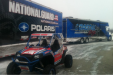
Someone asked about the taillights, yes window perf. Just tested them on here, worked like a charm, light shines right through them. I'll replace them with solid black and do the turn signals in the front.
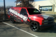
As for the contrast of color, it's crazy strong. A 100 yards away you see it and it looks like a big white logo on black. Get up close you see all the detail, exactly what I wanted.
Plus let's remember this is a wrap, I can change it next week if I don't think it works. I'll post a picture of what it looked like before.
Good overall job on the wrap ")