-
I want to thank all the members that have upgraded your accounts. I truly appreciate your support of the site monetarily. Supporting the site keeps this site up and running as a lot of work daily goes on behind the scenes. Click to Support Signs101 ...
You are using an out of date browser. It may not display this or other websites correctly.
You should upgrade or use an alternative browser.
You should upgrade or use an alternative browser.
Logo Critique
- Thread starter HaroldDesign
- Start date


SignManiac
New Member
I find the illustration difficult to make out at first glance. I like the concept but I think the artwork needs improving.
signgal
New Member
I'd like to see a different font on "dance studio" or maybe a more "graceful" font on the name but I'd like to see more of a contrast in the two lines... and I like the illustration. It's elegant and indicates movement whether you can tell at first glance what it is or not. I would be this client's customer and this concept would get my attention.
Circleville Signs
New Member
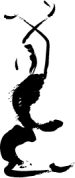
Good font choice, although I might customize the "T" in 'studio'. The downward slop of the intersect seems in contrast with the "uplifting" feel that most dance studios are going for.
I would then use the clip-art dancer that you have there as a template, and create a simple line drawing....Something like this...
Gary
I would then use the clip-art dancer that you have there as a template, and create a simple line drawing....Something like this...
Gary
Attachments
HaroldDesign
New Member
Thanks for the input! A little background - She is wanting a nice modern look, yet suggest it is mostly traditional dance (ballet). The art itself needs to be simplified. This is just what I made quickly from a photo she supplied me.
Circleville Signs
New Member
Yep - i figured that was along the lines of where you were at Caleb.
The drawing I did took about 10 minutes in Iluustrator with one of the built-in brushes.
Gary
The drawing I did took about 10 minutes in Iluustrator with one of the built-in brushes.
Gary
Circleville Signs
New Member
**blush**
Thanks")
Gary
Thanks
Gary
HaroldDesign
New Member
If she likes the art I am going to draw the contrast version of the original photo by hand, and then re-create the hand work in Illustrator. I really like the input you're all giving me!
rjpjr
New Member
I like the overall feel of the design. It shows motion and is fairly quick to read. The only thing that I would consider changing is the proximity of the dancer to "Inspire". I think I would shift the dancer away from the text a little bit and add a little breathing room there.
...my .02 cents...
...my .02 cents...