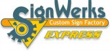
We have been using this logo for almost 10 years and never thought to put it out there for criticism. After seeing other posts in this forum, I thought , what can it hurt. So please critique away. Note: Border is not part of the logo.
-
I want to thank all the members that have upgraded your accounts. I truly appreciate your support of the site monetarily. Supporting the site keeps this site up and running as a lot of work daily goes on behind the scenes. Click to Support Signs101 ...
You are using an out of date browser. It may not display this or other websites correctly.
You should upgrade or use an alternative browser.
You should upgrade or use an alternative browser.
Looking for Critique
- Thread starter toddot
- Start date
SignManiac
New Member
Try and convert it to a .jpg and then upload it again. Make sure it's RGB. Then I'll be happy to have a look at it.
Marlene
New Member
"Werks" for "Works", can I ask why or why do you want to butcher a perfectly good word?
the gear thingy on the "S" in signs could work (or werk) with a little re-draw. the gear needs to be compeleted so that it doesn't have the sticky out thingy on the other side as I'm not sure what that is. the font could also be worked (werked) so that it looks more like it's part of the gear assembly as it looks like it almost is. see how the tail of the "g" in signs kind of looks like it is part of how the gear works (werks). the colors are kind of odd. it might work (werk) better in silver or grays and black as it would look more like a machine.
the gear thingy on the "S" in signs could work (or werk) with a little re-draw. the gear needs to be compeleted so that it doesn't have the sticky out thingy on the other side as I'm not sure what that is. the font could also be worked (werked) so that it looks more like it's part of the gear assembly as it looks like it almost is. see how the tail of the "g" in signs kind of looks like it is part of how the gear works (werks). the colors are kind of odd. it might work (werk) better in silver or grays and black as it would look more like a machine.
Jillbeans
New Member
I would take that S and tilit it just slightly forward.
Then bump down the IGN WERKS because it seems oddly arranged with the "W" so high.
Is it Sign Werks Express? Because Express seems to be just floating there.
Here are two quick suggestions. The second idea uses your S as a backdrop.
Love....Jill
Then bump down the IGN WERKS because it seems oddly arranged with the "W" so high.
Is it Sign Werks Express? Because Express seems to be just floating there.
Here are two quick suggestions. The second idea uses your S as a backdrop.
Love....Jill
Attachments

I kinda like it. Colors too. I think the top of the S should some how be made
to line up with the top of the W. Put the word EXPRESS inside the panel,
make it bigger if you need to. Move CUSTOM SIGN FACTORY to the bottom.
Take all suggestion and comments with a grain of salt.
to line up with the top of the W. Put the word EXPRESS inside the panel,
make it bigger if you need to. Move CUSTOM SIGN FACTORY to the bottom.
Take all suggestion and comments with a grain of salt.


SignManiac
New Member
I'm assuming the business name is SignWerks Express? I'd keep it close to the name and drop the other tag line beneath somewhere.
I think both Sign and Werks should share a similar baseline. I don't care for the HOLLYWOOD stagger effect. It looks all jabberwonky that way.
I think both Sign and Werks should share a similar baseline. I don't care for the HOLLYWOOD stagger effect. It looks all jabberwonky that way.